Image credit: Laura Reen
Although ‘personalisation in insurance’ has been a buzzword for a while, traditional insurers are still taking their time with having personalised treatments for their customers. To make it work, they need to transform digitally - and building up the proper infrastructure, processes and structural changes takes time.
A Youbiquity Finance report stated that 21% of customers say their insurance providers do not offer any customization. The only problem was… Insurtechs were faster. Insurtechs are digital-first, flexible to pivot and much more customer-centric than enterprise insurance companies. And in today’s world, customers expect information that’s available on demand and on every device.
And not surprisingly, they want personalised treatment.
In a recent Accenture survey, 80% of insurance customers claimed that they are looking for personalised offers and recommendations from their insurance providers, and a big chunk of respondents were willing to share their personal data in exchange for that personalisation.
 So what can you do about it? We’ve had our fair share of digital insurance products and we’ve got some tips from a UX/UI design perspective that can help you create a more personalised journey for your policyholders.
Simplify the onboarding journey
(and don’t ask the same questions twice)
One of the most dreadful aspects of getting insurance for customers is having to fill out lengthy questionnaires about their habits and behaviours. Of course, calculating a quote requires very specific and detailed information, but there’s always some way to shorten the customer journey.
While doing a UX audit for the MedUNIQA mobile app, we found that the internal client registration process was very long - it consisted of 8 separate steps (or screens), compared to just 2-3 steps in competitor’s apps. Internal clients were those that already had an active policy with UNIQA and were signing up to use the MedUNIQA app to manage their health insurance. During registration, users were expected to first enter some personal information and then answer wether they have an active insurance policy. Afterwards, they were asked to enter their personal data again, in order to match the records.
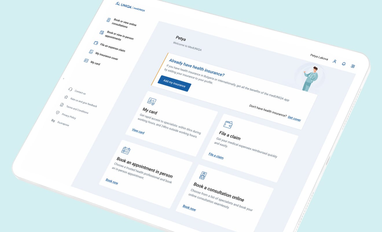
We switched those two questions around - the user is first asked whether he/she has an active policy and is then prompted to enter his personal data. This small change, together with a few other design enhancements, shortened the journey to just 4 screens, making the onboarding much faster and easier for users. Check out the full MedUNIQA case study for more details.
Make your service available for customers when they need it the most
A lot of traditional insurers rely on policyholders to request a policy on their own. Customers don’t want to be flooded with unsolicited and irrelevant offers, right? Only that’s half the story. The other half, is that often times customers would forget or simply would not be aware of all the different insurance options out there. From a product perspective, you could offer standard bundled solutions at a cheaper price - combining home and auto insurance for example. But that’s far from a personalised policy.
Insurtechs like Dayinsurance and Veygo offer hourly car insurance for as little as 1 hour, online quotes and instant coverage that is activated on the go, via a mobile app. Cuvva customers get notification reminders through their app when the policy is ending and almost a 24 hour live chat support in the app, with a 1-minute response time. Cuvva even goes a step further with personalised, smart pricing - ‘the better you drive, the less you pay’. All of this is possible through location and motion technology within the mobile app.
 Image courtesy of Cuvva
Design and interact with empathy
Insurance is an industry that customers often interact with when they are not at their best - emotions might be running high after a difficult experience, or anxiety kicks in because of the possibility that something bad might happen. What are your customers going through at the moment of interaction? Are they looking for the cheapest price for a policy? Or are they in a crisis following an automobile accident?
Through deep UX research, you can get useful insights that can inform how to upgrade your customer journey for their needs. Insurers like Metromile with savvy UX allow users to upload photos with geolocation to report damage, or record videos to quickly explain details of an incident in plain English.
.png)
At GEICO, the UX team regularly shadows calls with agents, listening to specific scenarios, and the troubles and frustrations customers have. “This is an opportunity to lean in, to say, ‘I’m really sorry to hear that, can you tell me more about why you feel that way,’” says senior UI designer Elizabeth McCormick. “We are always looking for ways to make the interactions as empathetic as possible.”
Get rid of the insurance jargon and provide more guidance
Trying to make sense of a policy, get a quote, or file a claim can be an intimidating experience, especially if there’s a lots of legalese and specialised terms in the insurance policy. And we get it - insurance contracts are complicated because they have to protect the insurer in case of a lawsuit. But when it comes to how customers are onboarded, it’s worth considering what options you have to simplify the language and provide more support.
Oscar Health pinpointed this consumer struggle very precisely and, quite successfully, built its whole marketing messaging around providing insurance “that just makes sense.” A vital part of any user experience design is language - even the most intuitive and modern interface will suffer if the writing is bad. UX writing is a crucial part of UX design that has the sole purpose of writing clear text and cope and help the user navigate the app for its intended purpose. You would think customers are aware of benefit periods, face amounts, and payouts but if they did, there wouldn’t be any insurance glossaries. Here’s some useful UX writing guidelines you can take inspiration from:
- Be purposeful
- Position the content with the highest priority toward the top of the page. Users should be able to get the most critical information right off the bat
- Be conversational
- Use a positive tone of voice when the process is mundane or could cause irritation
- Be concise and clear
- Compare “Would you like to save your changes?” with “Save changes?” Which one is more concise?
- Be consistent
- If you decide to call the process of arranging something “Scheduling” in one part of UI, do not call it “Booking” in other parts of your UI.
The bottom line
A truly individualized insurance is no easy task. And, product personalization is particularly complex in financial services, where the need to consider and price for risk adds an additional dimension. But the old once-a-year insurance policy is now static and irrelevant. Insurance is now a living, breathing thing that should be adapted for your customers.
Check out our customised offer for user experience and user interface, specifically made with insurers in mind. We can help you develop a seamless digital experience for both your policyholders and agents that is personalised, available on-demand, and on every device.