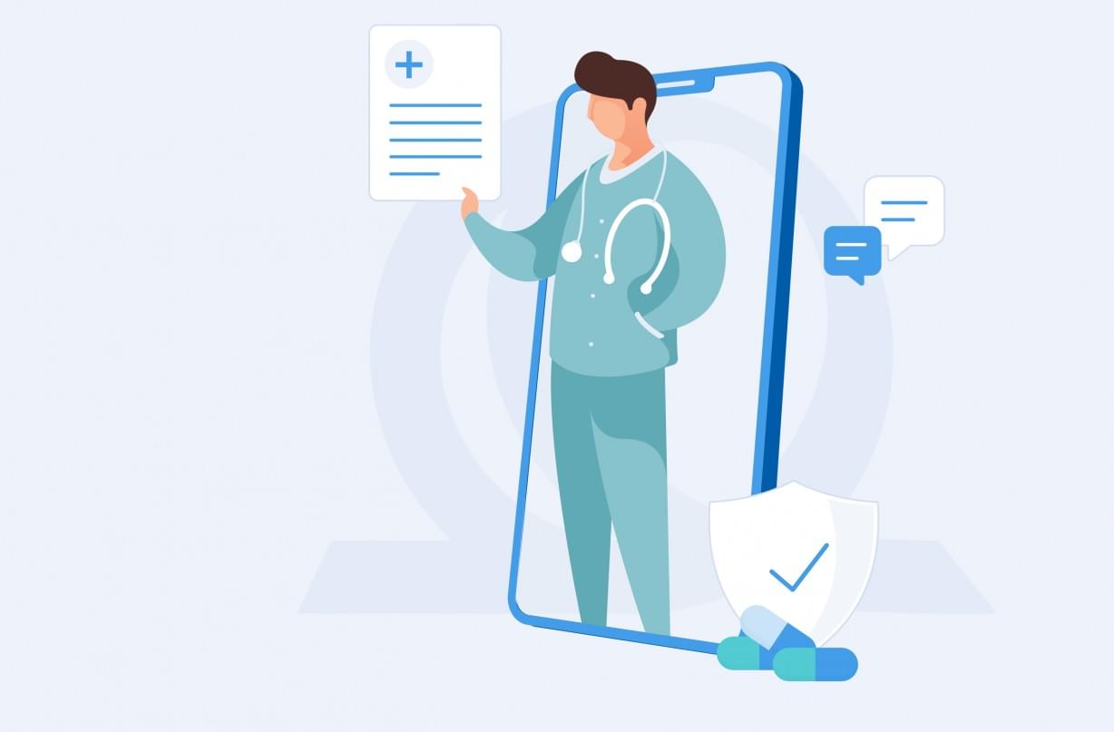
MEDUNIQA
How an improved UX delivers business gains for UNIQA
The client
UNIQA Insurance Group is one of the leading insurance groups in its core markets of Austria and Central and Eastern Europe (CEE), repeatedly voted the most trusted insurance brand in Austria. Over 22,400 employees and exclusive sales partners serve 15.8 million UNIQA customers in 18 countries. In Bulgaria, the insurer offers a wide portfolio of solutions in the areas of general insurance and life insurance, operating through Uniqa AD and Uniqa Life. For over 30 years, UNIQA Bulgaria has been a symbol of reliability and fairness for both its customers and partners.
The Challenge
Тwo years ago, UNIQA Bulgaria launched the mobile app app MedUNIQA that enables clients to consult with doctors remotely, book an appointment and manage their health insurance policy online. MedUNIQA was available for both clients with UNIQA health insurance (internal clients) and those without, but who would still like to use the services at an additional cost (external clients). Although the app offered useful services, not many customers with a health insurance policy were registered to use the app, and the number of registered external customers was even lower.
UNIQA quickly realised that while the app was serving its purpose, many of UNIQA's clients were not making the best use of the app's features. The users were clearly not convinced of its benefits and many preferred visiting the UNIQA office, rather than using the app.
Objectives
UNIQA focused on improving the MedUNIQA app’s performance in four key directions:
- Increase the number of registrations
- Increase the number of online consultations
- Increase the number of active users
- Find additional revenue streams
Our Approach
We conducted a comprehensive UX/UI audit to find the underlying issues that were preventing people from using the app.
We started the project by analysing all available internal reports and conducting interviews with UNIQA employees, as well as UNIQA clients. We then moved to examining the user experience for both internal and external clients, and finished off the research with a benchmarking analysis of Bulgarian, UK and US markets. The audit led us to valuable insights, such as:
Valuable insights
- Internal client registration was taking too long
- There was limited background information about the doctors and no user reviews and ratings.
- There was no option to upsell additional health coverage in the app, so clients had to either call or visit UNIQA offices.
The Solution
We partnered with the original developers of MedUNIQA (Zingasoft) to take the app to the next level, and while we took care of the UX/UI design, Zingasoft worked on the development.
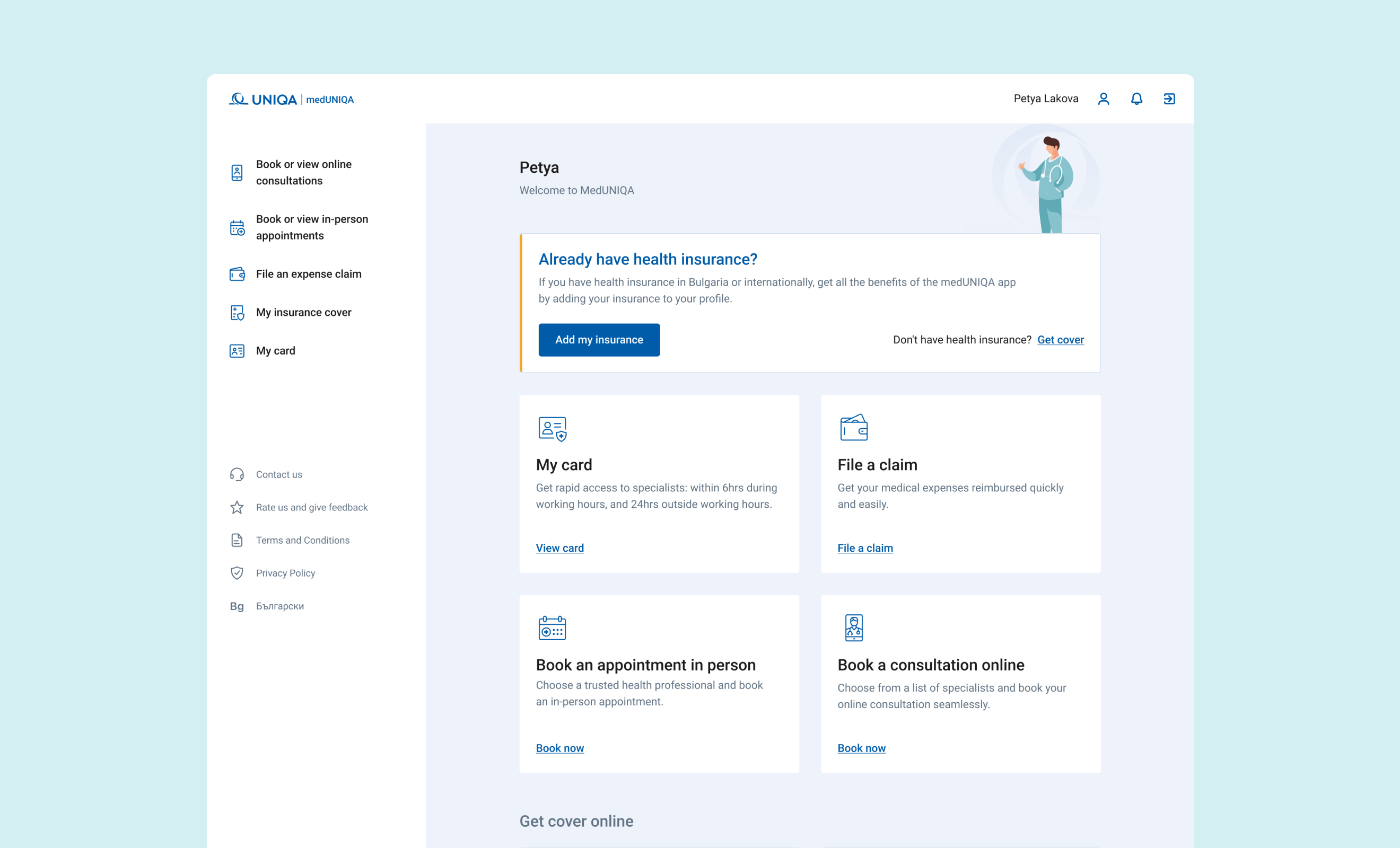
Alongside the visual improvements, together with Zingasoft we delivered the new functionalities and a great fresh product with a completely brand new look and feel. We addressed all pain points that we discovered during the UX/UI audit and connected them with UNIQA’s business goals.
Internal client registration was taking too long
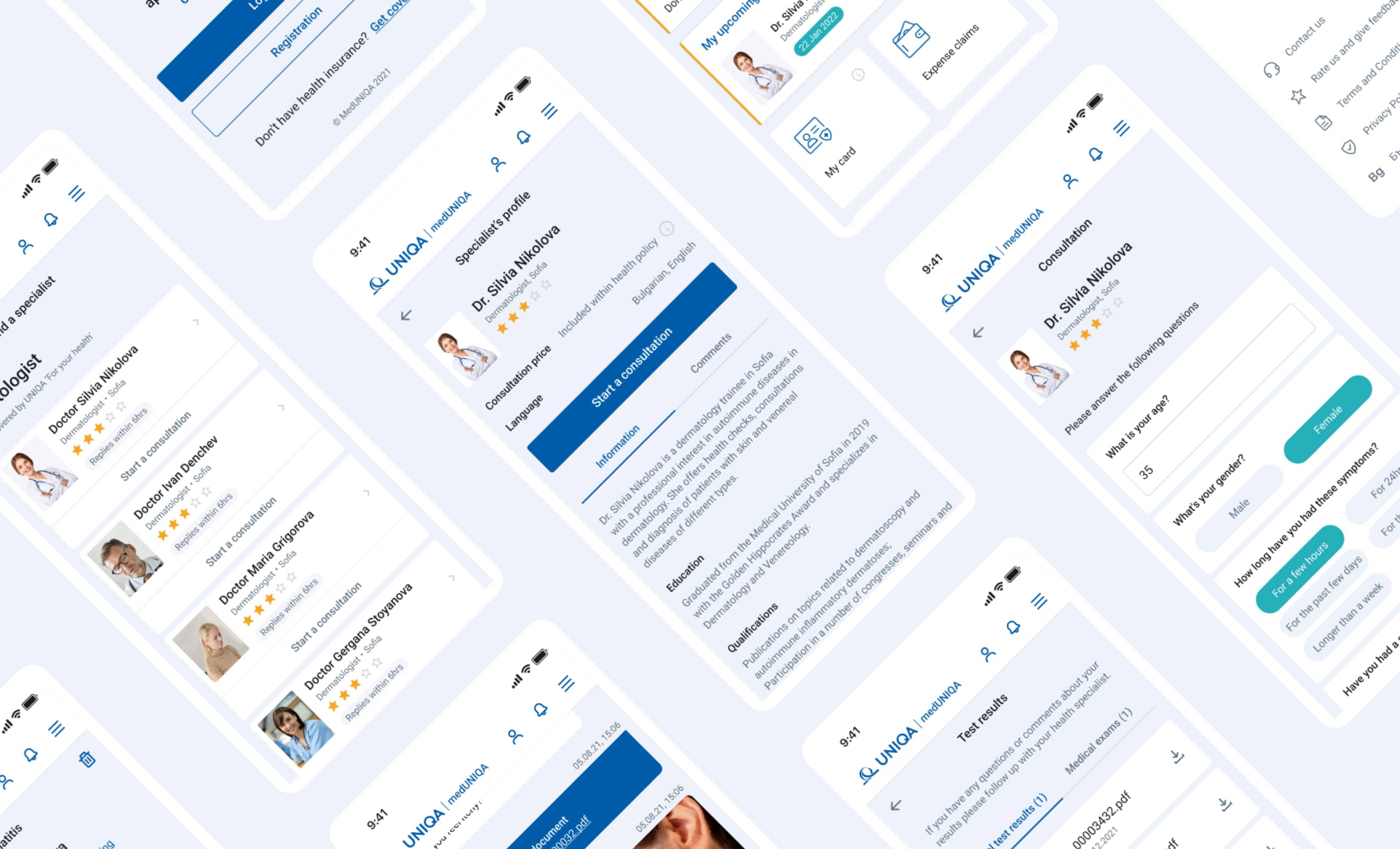
We simplified the user registration form into a more seamless journey and included recommendations for a step-by-step onboarding tutorial within the application
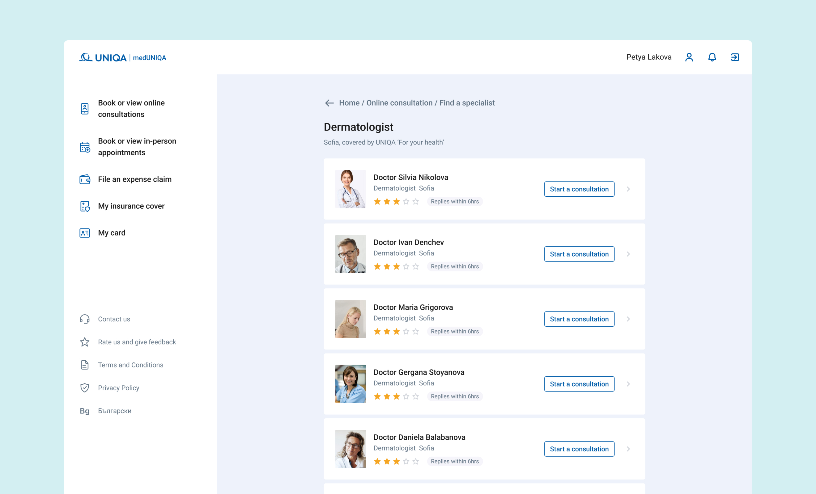
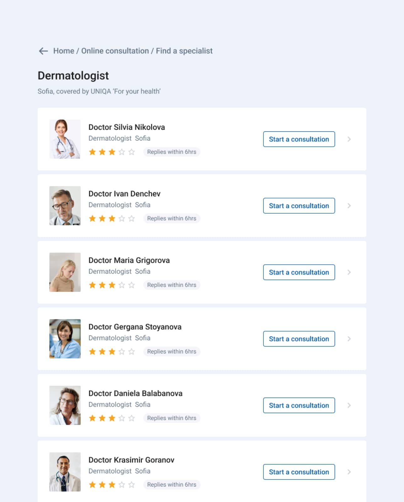
There was limited background information about the doctors and no user reviews and ratings
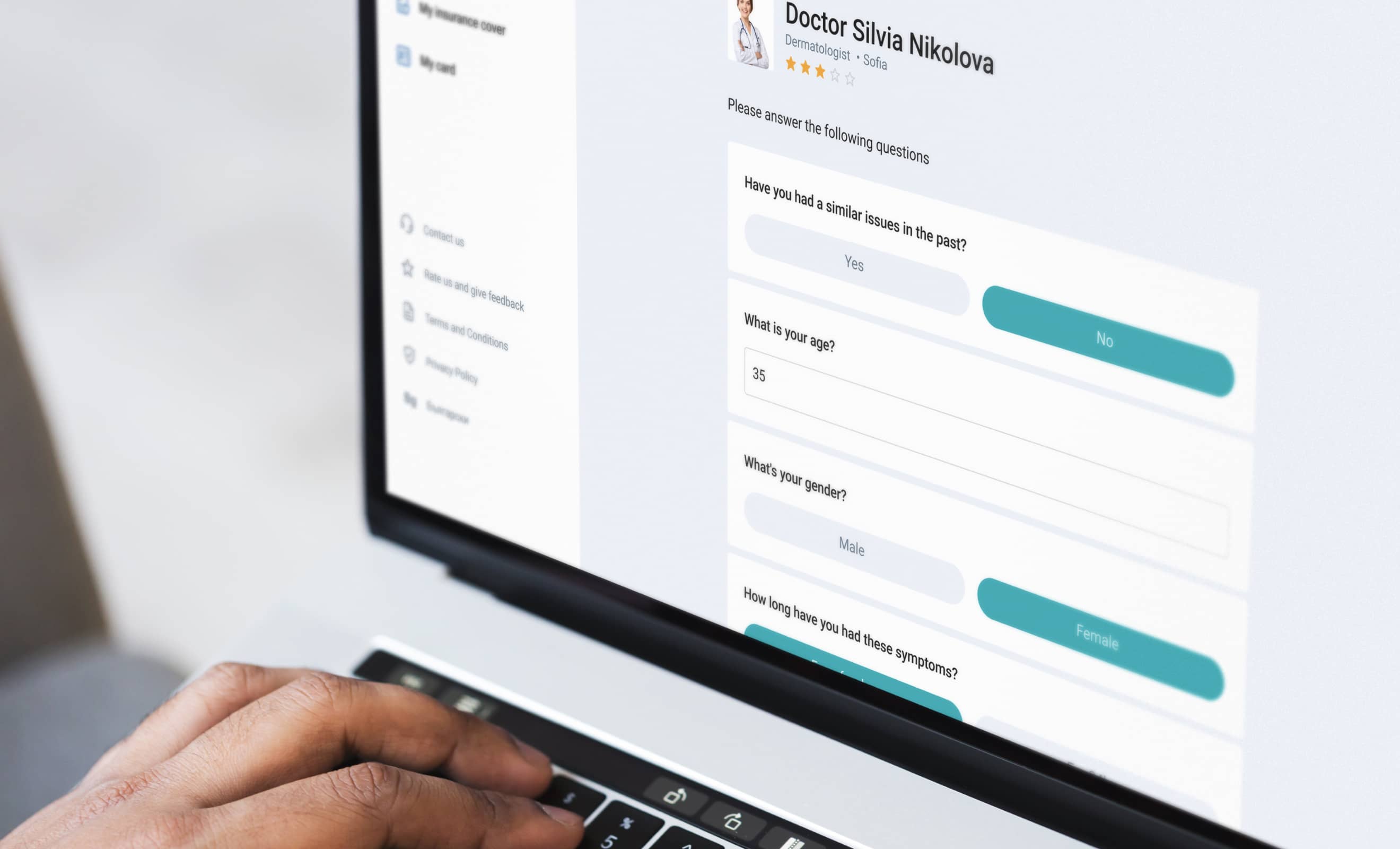
We added additional fields with information for each doctor featured in the platform, like years of experience. We also included a detailed rating and user comments for each doctor, to help users make an informed decision when scheduling a consultation
The design of the app needed an update
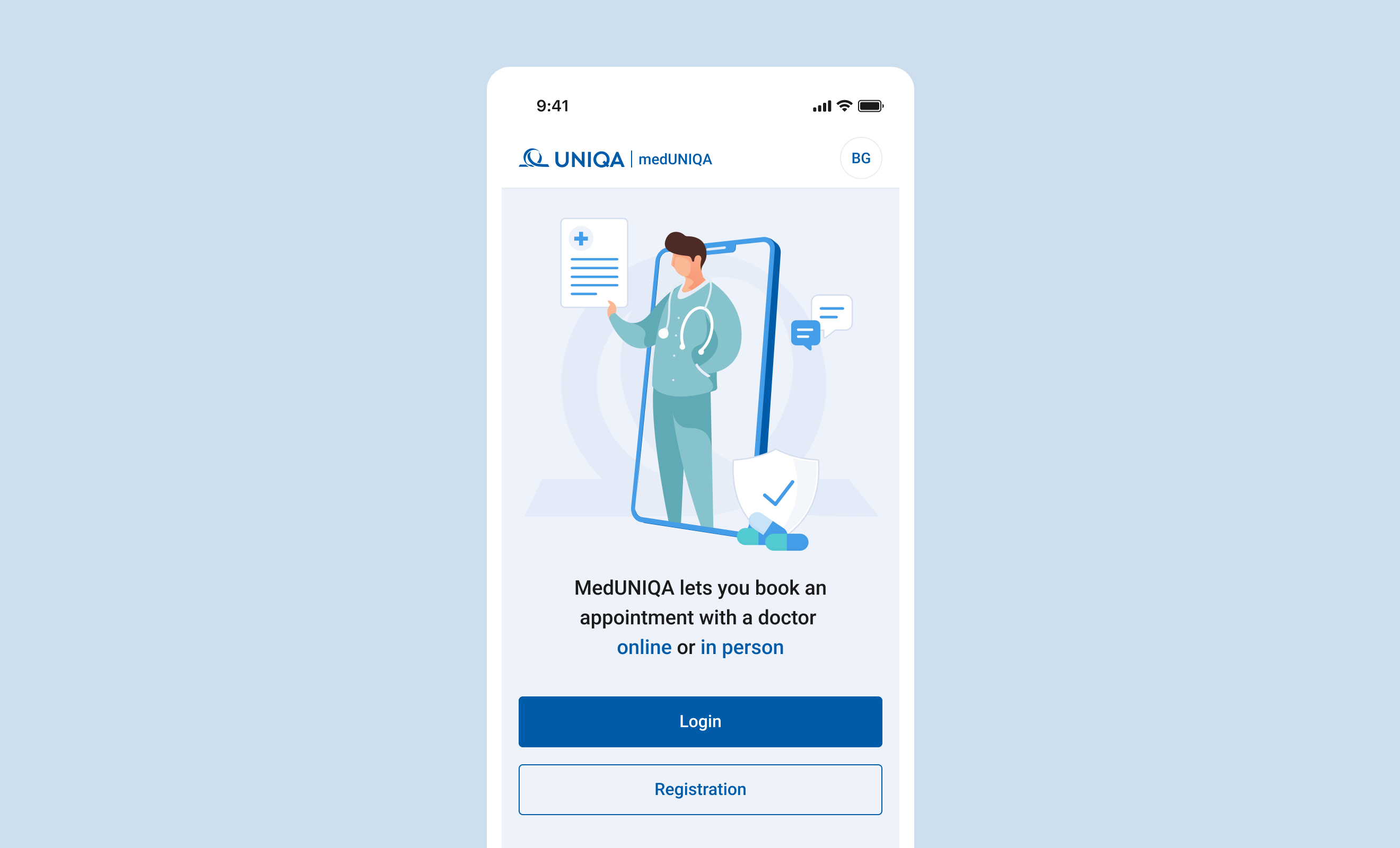
We refined the app’s visual identity into a warmer, friendly vision. On top of that, we included icons to highlight the features and a personal greeting when the user opens the app, to make the interface more welcoming
There was no option to upsell additional health coverage in the app, so clients had to either call or visit UNIQA offices
We included additional space within the updated dashboard design for promoting additional or related insurance products
There were very few options for users to provide feedback
We placed feedback banners in strategic places in the app, to encourage users to give their opinion about the app and the services
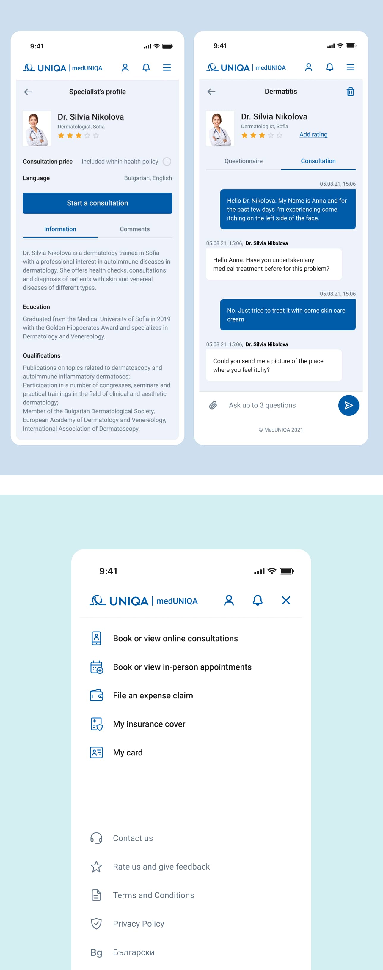
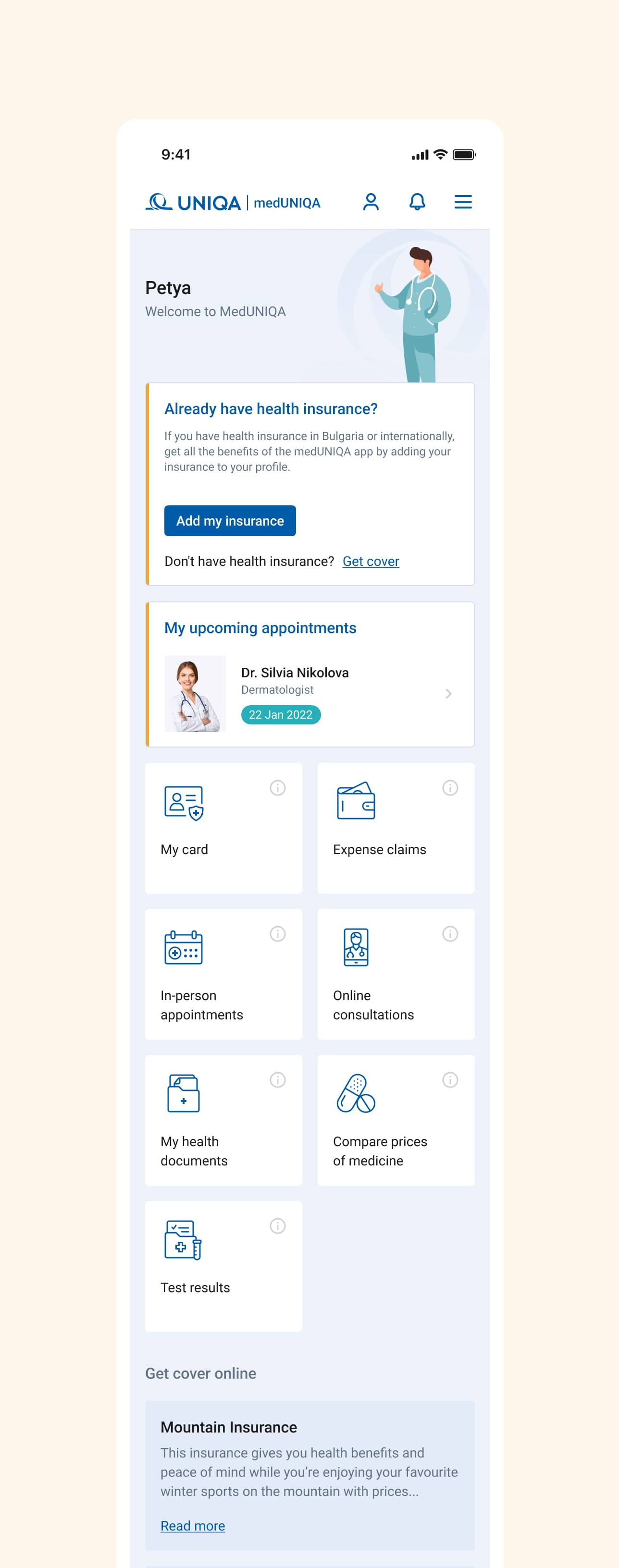
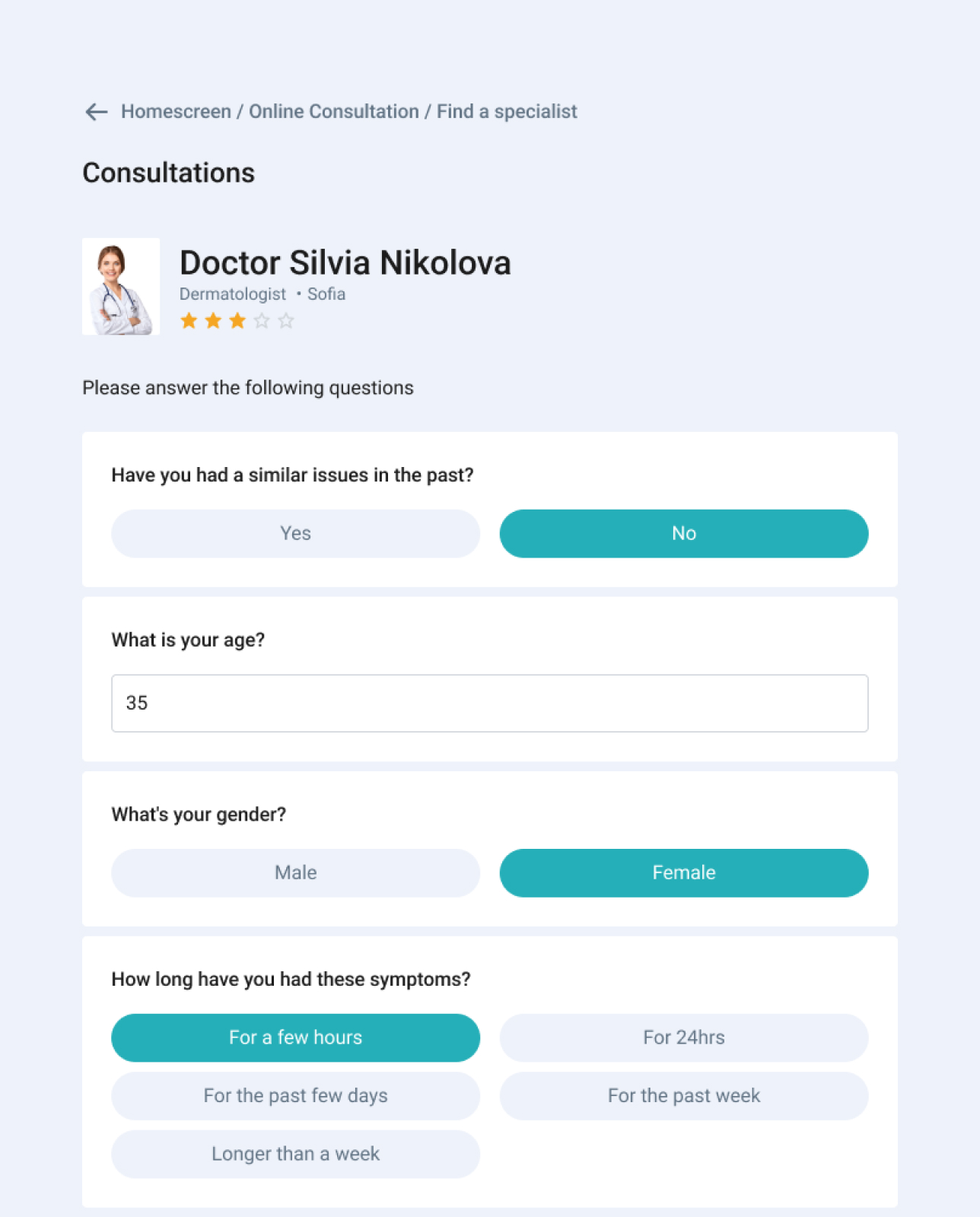
Staying true to UNIQA’s values of always putting the user at the centre, we aimed at creating a simpler, more straightforward design that focused on the most frequent actions users take:
- My digital health card
- File a claim
- Book a medical appointment
- Online consultations
On top of that, we’ve also worked with UNIQA in improving the landing page and dashboard copy and presenting the product’s benefits and features in a more compelling manner.
The Result
Insurance can be confusing. Trying to make sense of a policy, get a quote, or file a claim can be an intimidating experience. We saw this as an opportunity to transform this weakness into a strength by improving the user experience. With the redesigned MedUNIQA app, users can now enjoy a simplified registration process, a quick and easy way to book a medical appointment, improved navigation and a new look and feel of the app that’s more welcoming and comforting.

We really enjoyed working with Despark. I was really impressed by their determination to understand user needs down to the last detail. They make gorgeous products and are amazing to work with.
