1.jpg)
In one sentence, how would you annoy a UX designer?
“Can we add this button also? We have a lot of space anyway.”
“But the developers prefer dropdown menus.”
Just make it pretty. That's what you do, right?"
“We need to build it now, we will UX it later.”
“We don’t need usability testing.”
“We really want it to really pop.”
Are you guilty of some of those sentences as a client? There’s a common saying that ‘the customer is always right’ and while we want our clients to be satisfied and taken care of, sometimes we prefer to politely disagree with them, for the purpose of creating a better product for all stakeholders.
So here are the ground rules we like to follow during the whole project scope in terms of UX/UI. Sometimes they might be a bitter pill to swallow for clients, but we know from over a decade of firsthand experience that this is the way to go.
1. Do solid user research
While some say user research is overrated, we believe the opposite. We don’t want to make assumptions about users' behaviours and reactions across differing and unique projects. Instead, we prefer designing based on data that shows who the users are and how they actually behave.
 Our process usually starts with discovering the ‘why?’ Why are we designing this product? What is the product’s goal? Who are we designing it for? What problems do users face while using it? Once we’ve discovered and collated the information to hand, we collect the data we are missing from surveys, interviews and questionnaires from real users.
We also like to be efficient and we prefer getting feedback from users when we have something to show them, like an MVP (minimum viable product). Depending on the project and time scope, we choose when and what type of user research to do, but one thing is clear: it never ends well if you skip it.
2. Be human-centric
We are firm believers in putting the human at the centre of everything we do. We understand human-centred design as design that stems from the needs of the people using the product, rather than expecting users to adjust their behaviours based on the product. We strive to be empathetic to the user and to create authentic and meaningful solutions that empower and improve people’s lives. So if we advise against sticky patterns and addictive features, it is because we don’t see the real benefit for the user.
3. Prototype before you build a real product
After the initial research is done, a sample of the finished product is developed for key stakeholders. Usually, this includes wireframes and UX prototype creation. The prototype is an essential step for the clients to validate what the product’s direction should be and for the most part dictates how ‘the real thing’ is going to look. So we advise our clients not only to get it out there, but to consider it thoroughly before we move on into development. Jumping into building the real product without carefully considering the prototype can be a costly mistake, in terms of both money and time.
4. Avoid dummy placeholders
“design it now, we will provide the content later”
Many times clients don’t have a clear idea about the content and want to speed things up with the design, which makes dummy text a reasonable approach. This way, they get extra time before they need to address questions about content and messaging. But design is not solely a visual or technical matter. Design and content work together to create a meaningful experience. And while you don’t need design to write the content, it doesn’t go well the other way around.
Another problem with “Lorem ipsum” is that when the design is built around placeholder text, the actual content usually doesn’t fit properly in the designed spaces. This means that boxes, and images need to be resized and moved around to fit in with the context, resulting in lost time and resources. Instead, we advise clients to recycle old content or do a “bad first draft” that is at least a starting point, which we can use when designing.
5. Chase simplicity and consistency
Just make it pretty. That's what you do, right?"
When we build digital products, we make them easy for the user to understand and interact with. That’s the whole point of user experience design - to make the digital products intuitive to use. Consistency, on the other hand, means that we strive to keep the same style and design elements within one product, to avoid confusing the user unnecessarily. For every product, we create a visual direction, a theme, as well as a style guide to ensure everything looks and feels the same.
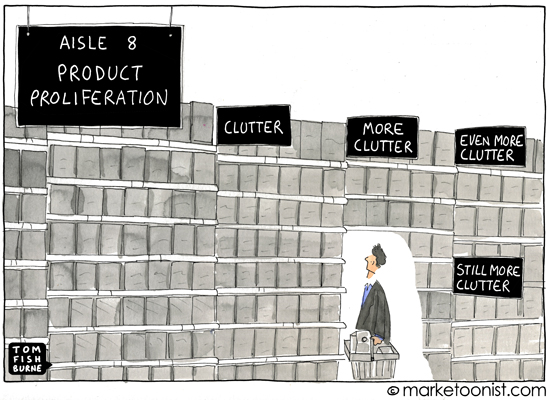
6. Less is more - Don’t overwhelm users
“Can we add this button also? We have a lot of space anyway.”
In user experience design, less is almost always more. We strive to simplify interfaces by removing unnecessary elements that don’t support user tasks, without limiting experiences. So when a client asks us to add that extra button in the white space, we try to remind them that people’s attention span keeps decreasing. Besides, based on Hick’s law, it takes longer to make a choice when we have too many options in front of us.

7. Design for diversity
“We really want it to pop”
We believe in delivering digital products which have a meaningful impact on how people experience the world. We strive to create appealing products, but not at the expense of functionality. After all, the most important job of a digital product is to perform a function. More than that, we consider that all users are not the same and we need to make sure our products are accessible for everyone. A well-designed product is accessible to users of all abilities, including those with cognitive, motor or sensory impairments.
8. Be a team player
Making things of any complexity requires cooperation and collaboration. And we believe great user experiences are made when designers, developers, stakeholders, and users come together. When people articulate their ideas to someone else in words or sketches, they advance their thinking. Different collaborators inevitably bring different frames of reference — and fresh thinking — to the problem, which ultimately elevates the work. By combining individual abilities and perspectives, we build collective knowledge that allows us to make more cohesive and balanced decisions.
Why all this matters
Maybe you read those ‘how to annoy a UX designer’ sentences and recognised yourself, or your boss or colleague. You might feel amused, ashamed or even angry. How dare some digital agency tell me what to do or say! It’s my app.
Among the top skills of a UX, and wider digital team is empathy. Putting ourselves in the shoes of the user. Sometimes it’s easy for other agendas, egos, or stakeholder requests which lie outside the user’s best interests to muscle in. It doesn’t mean we should let them. Our goal in putting together these mantras above is to make our practice and philosophy more transparent, both for our own team, and for those clients we work with. One of the things we’re most proud of at Despark is that our clients always value the depth, transparency and trust of the working partnerships we forge. If you tell us to ‘make it pop’, we’ll certainly argue with you if we don’t think your request is justified. But we’ll listen to you too; the conversation always goes both ways.


