.png)
2021 was quite a year for everyone. While Richard Branson and Jeff Bezos were aiming for the stars, NFTs have taken the world by storm, and #metaverse became a new trending hashtag on Twitter. And this is just the beginning. Beneath the big headlines, UX design has been changing rapidly, as internet and tech device usage has grown exponentially in the last two years. As UX designers try to cater for ever-changing user needs, the design field has become one of the most dynamic. So what can we expect in 2022? With the help of our design and frontend teams, we’ve handpicked the UX/UI trends we expect to see in the months to come.
Tl;dr
- Illustration and animations
- Microinteractions
- Minimalist UI
- 3D design
- Accessibility in Design
- VR/AR and the new ‘verse
-
Illustrations and animations
Animations are going to be strong allies in improving user immersion and experience and is definitely something we will see more of in the future. Combining stop-motion, 2D and 3D animations will probably be far more common. Explainer videos were once a trend that emerged to help explain complex products (usually tech ones) in a simple, visually-appealing manner. Headspace, Etsy and Waze are just a few examples of apps that made illustrations their signature look. We’ve also had our fair share of illustration-driven projects in 2021.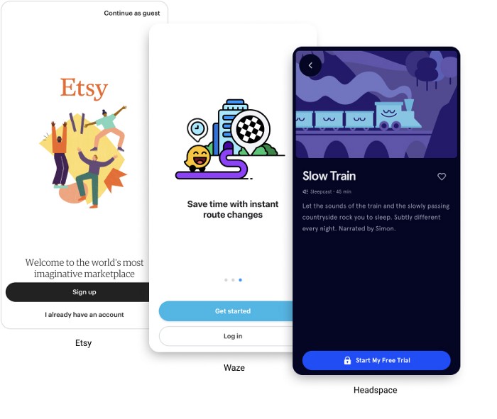 Image source: Shakuro.com
-
Microinteractions
The animation also applies to icons - any small animated details in the interface that can make the user experience smoother are a big plus. Microinteractions are small interface changes that help users navigate a website or an app. They can be visual, sound effects, or both, and they give the user cues about what the action will lead to, and what needs to be done next. They are a useful method to simplify previously lengthy procedures to achieve a certain action because they bring more meaning to the elements of the interface.
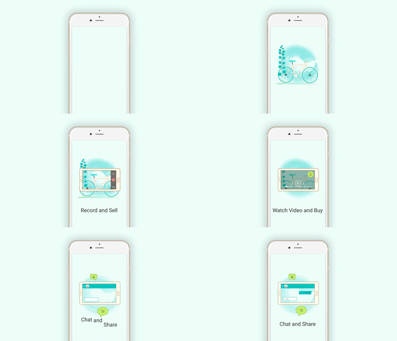 Example of a microinteraction used to simplify the onboarding process in an app. Credit: UXdesign.cc
-
Minimalist UI - Less is more
Let’s face it. Most consumers find pop ups, excessive notifications and huge banners annoying and obstructive. In a world of constant ‘attention-grabbing’ widgets, a more minimalist approach will bring a much-needed refreshing experience for users. By removing all the distractions, consumers can have their attention devoted to the content that they came for in the first place. And excluding the bells and whistles will free up space for innovative ways to enrich content through more immersive and bold design.
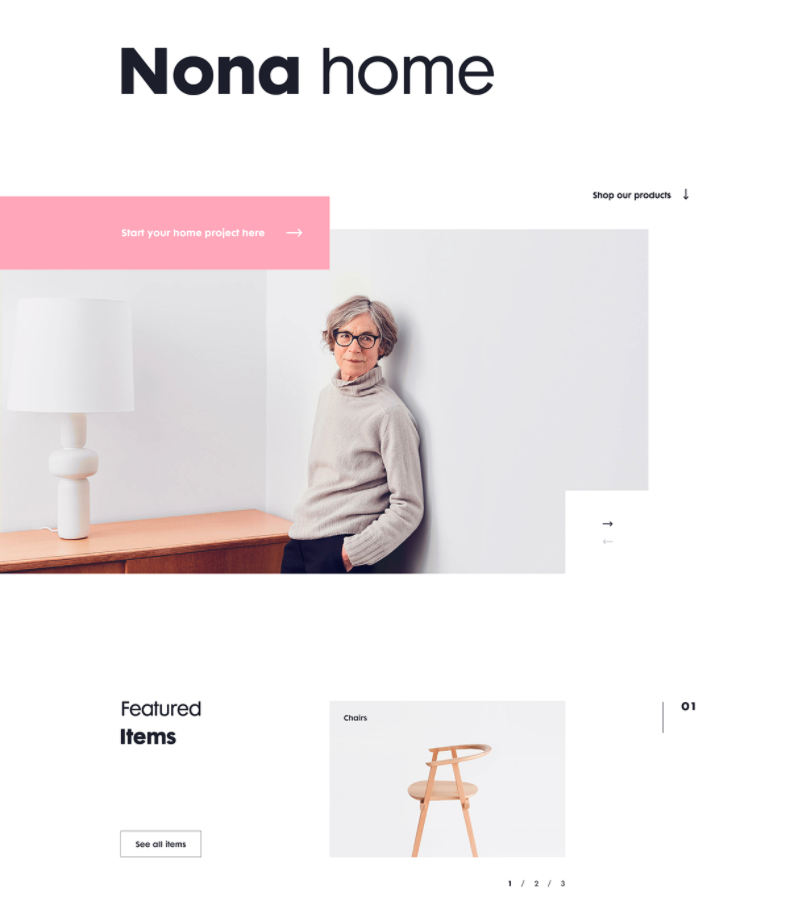
Example of a minimalist Website design. Credit: Daniel Tan, Behance
-
We see in 3D
Speaking of more immersive design, we couldn’t skip the 3D craze, although it’s been around for a few years in numerous UX/UI design trends reviews. But they have their rightful place in this list. AsUX planet said:
“it is much easier to convey energy, texture and meaning through 3D because it is closer to our perception than a flat picture.”
Thanks to new frameworks and internet speeds that have made page or application loading faster, 3D-styled objects are definitely going to be much more common than they used to be.
In 2021, we worked with Ilumoni, a UK-based AI-driven app designed to help its users understand and manage their borrowing. Ilumoni needed a redesign of the app to bring an improved user experience with smooth flows and visually appealing data presentation. As financial data is typically context heavy, our priority was to create visually appealing data presentations in an engaging, easy to understand way. 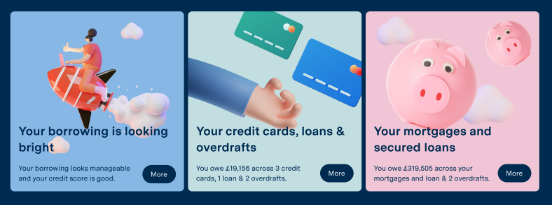 3D illustrations by the Despark Design team for our client Ilumoni
-
Design for All
Lastly, UX trends have moved beyond making good-looking apps. As technology evolves, developers and designers are trying to make their apps more accessible. From targeting multiple types of colour blindness to making apps easy-to-use by voice command for visually impaired people, good design is about dedication to reality and the needs of every user.
Last year we were thrilled and humbled to partner with Unicef in creating the ‘Help me thrive’ platform, which enables children with disabilities and special needs to access education resources and develop their full potential in an inclusive and protective community.
During the Discovery stage of the project we interviewed over 20 specialists and tested the initial design prototypes with groups of parents, specialists and people with varying accessibility needs, to make sure all user interfaces were accessible by everyone, while also meeting WCAG 2.1 AA accessibility standards.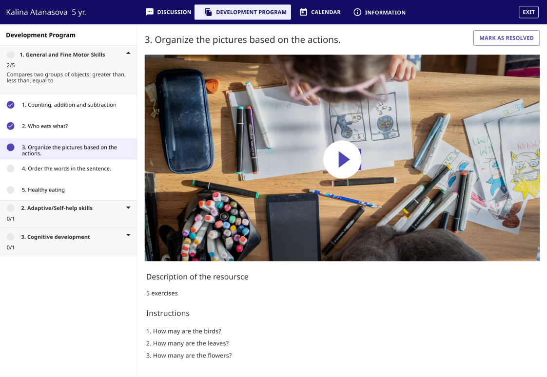
-
VR/AR technology
Tech giants have immense power to launch any trend by pouring money into research and creating new products. The Google glasses concept might have failed in 2010, but Google’s efforts in AR & VR are very much alive, and Facebook (now Meta) is not leaving the market untapped. There are also rumours around Apple releasing their own mixed reality eyewear. And while it is unlikely we’ll see people walking the streets with VR headsets from next year, it is definitely on the horizon for UX designers.
In conclusion
Design is always changing. But the meaning of design always stays the same - it is a plan for solving a particular problem. So when looking at the current trends, don’t forget that there always needs to be substance behind the style. It’s not enough to just be cool: a concept has to execute too, otherwise it will fall flat, no matter how on-trend it is.
We’ve been creating digital experiences for over 14+ years now and we’ve witnessed trends come and go.. Whatever the trends, our philosophy for UX/UI also stays the same - to guide us in being consistent in all design decisions we are making. Our goal is and always has been to create meaningful digital experiences that improve people’s lives.
Ready to start a conversation about your digital product or idea? Get in touch.

