Simplicity is often referred to as one of the fundamental principles of UX design. But simplicity is subjective and quite difficult to define. Simple design might refer to how 'clean’ the design is, how simple or complex the build is, or how many (or how few) features are included. But is simple design easier to build?
Below, we explore some failed attempts of Windows 8 to achieve simplicity back in 2012. But don’t be too quick to judge - Windows 8 was actually ahead of its time.
The complexity of simplicity
It seems contradictory at first, but simple design is actually very hard to execute. The strive for clean and simple digital products these days is the result of years of research and studies into users behavior and human psychology. It is also the result of multiple layers of decision-making of how things work together, called "The five elements of UX design". Most of them have been conducted long time ago, but the digital industry seems to have managed to extract the results from them and by applying into products, has increased the usability of products. Studies have even become part of what we now call Laws of UX. Some examples include:
The Pareto principle states that for many events, approximately 80% of the consequences come from 20% of the causes. A surprisingly wide range of contexts can capture this 80/20 imbalance, such as:
-
20% of websites capture 80% of web traffic.
-
20% of customers generate 80% of the company's revenue.
-
80% of your users use 20% of your features
In a UX context, this principle can offer a way to focus your energy and efforts on those 20% of features that are relevant for your users, instead of creating an all-encompassing product with tons of features that might complicate the experience. That's also one of the fundamental principles of having an MVP mindset.
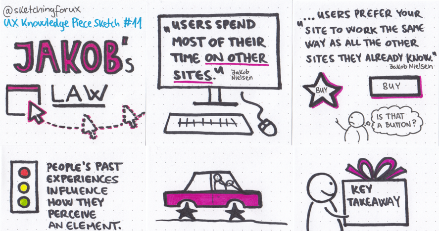
Jakob Nielsen, co-founder of the Nielsen Norman Group, states that users spend more time on other websites than on your website. This means that users prefer your site (or application) to work the same way as all the other sites they already know. They will transfer expectations that they have built around one familiar product to another that appears similar.
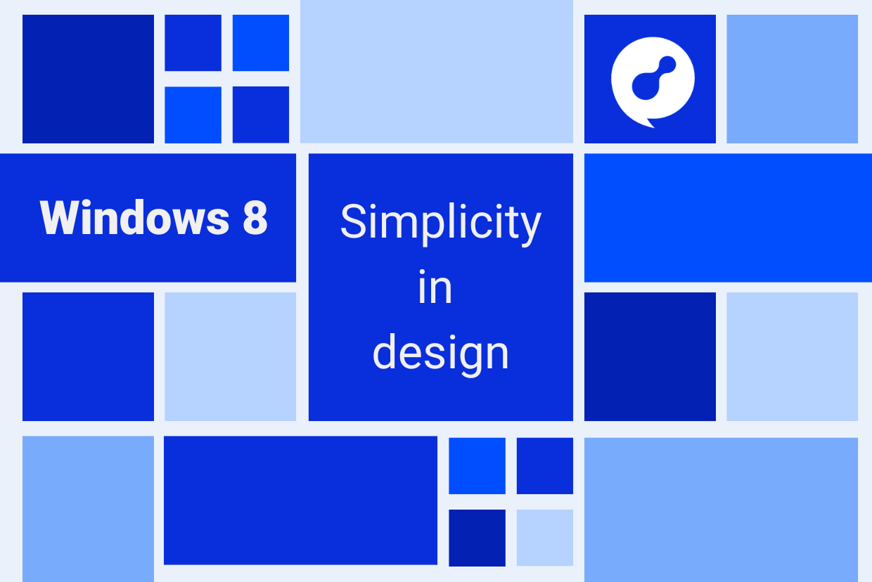
Windows 8 (MDL Metro): a lesson of simplicity gone wrong
'Flat design’ is one of those trendy designs in UX/UI that we see everywhere as the new hot stuff. But actually the first beginning of flat design trend become more popular by Microsoft back in 2010 when they released Windows Phone 7 (previously, flat design elements could be captured in products such as Encarta 95 and MSN 2.0).
Then, in 2012, Microsoft launched their revolutionary Windows 8 OS with the newly developed design system called Microsoft Design Language (MDL), also known as Metro. The design language was inspired by the simplicity of road signs and visual symbols. Like the art on road signs, Metro relies on flat shapes, flat icons, colour, and contrast to make the User Interfaces as simple and clear as possible.
Although it was generally not well received by users, it sowed the seeds of the current trends and I think there’s many valuable lessons we can extract from it now.
Windows 8’s multi-device philosophy
Microsoft’s new radical new operating system was developed for use on various devices - phones, tablets, laptops and desktops. From a technical standpoint, maintaining a single, core operating system with a consistent set of application programming interfaces (APIs) makes a lot of sense. From a user perspective, providing the same user interface on every platform, too. So where did Windows 8 go wrong?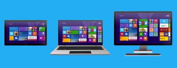
Image credit: Fast Company
For starters, Windows 8 prioritised a new-touch centric interface (typical for tablets and phones) over the traditional point-and-click functionality for desktop, which meant users had to learn new ways of interacting with Windows.
For example, to scroll through recently used apps on a Windows 8 touchscreen tablet, you simply use a swiping motion with your finger. But on a desktop PC, you must hover your mouse cursor in the lower-left corner of your display, and then move up to see a sidebar with thumbnail listings of recently used apps. And this is just the beginning. The tablet version of Windows 8 also introduced multiple complicated gestures, where similar (or identical) gestures have different outcomes depending on subtle details in how they’re activated or executed.
Based on Jakob’s law, learning new models of working distracts the user takes away from their focus. Instead of being able to focus on their main task at hand, users struggle to learn and remember gestures.
The 20/80 rule gone all wrong
In a statement following the release of Windows 8, Microsoft said Modern interface was designed for “your computer-illiterate little sister, for grandpas who don't know how to use that computer thingy, and for mom who just wants to look up apple pie recipes.”
What that means is that Windows 8 interface was created for casual users that mostly consume content - people who want to check Facebook, view a few photos, post a selfie”. In other words, the user can do “one thing relatively easy”.
On the flip side, Metro was not geared for content creators - those that do complex machines and multitask. Ironically, Windows 8 removed ‘the windows’ - all apps opened in full frames (as is common on a phone) or in a rigid split-screen. Either way, mutlitasking while keeping up with Twitter, a word processor and a dozen browser apps did not work. 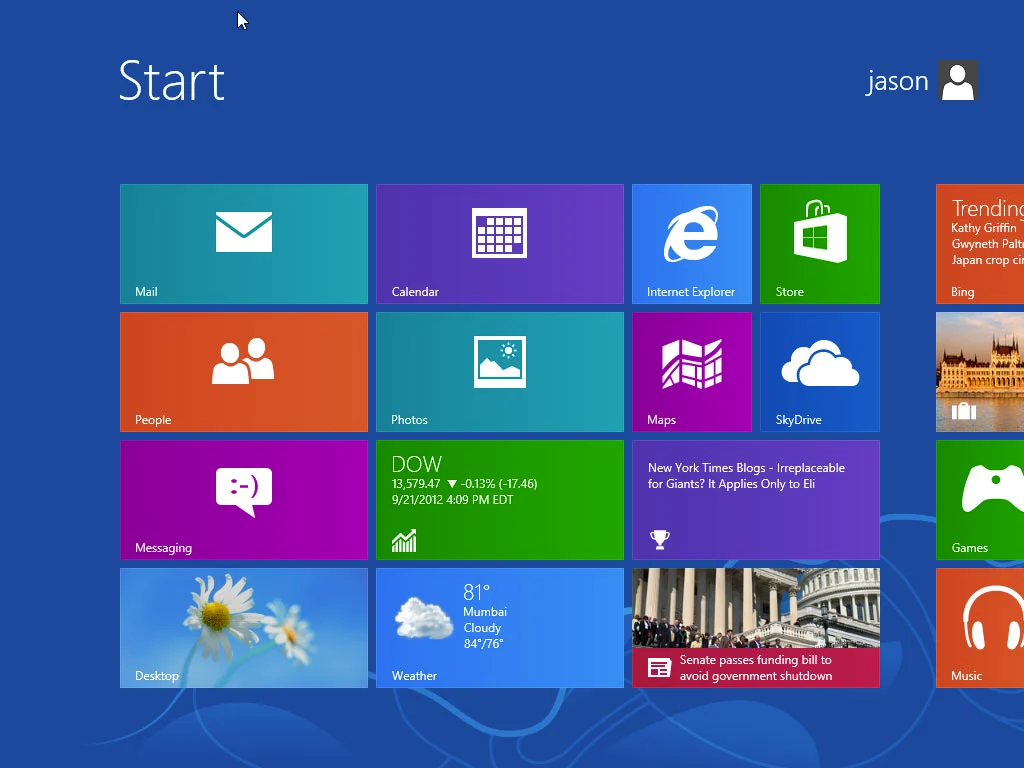
Image credit: Port Forward
While we can’t know for sure what the ratio between casual and power users was, it’s clear that Microsoft prioritised casual users, who probably used only a small portion of the previously available features. So they decided to focus on them entirely. And yes, while this might be the rule (80% of your users use 20% of your features), it obviously alienated core users.
Windows 8 was ahead of its time
As you can see from these examples, to the best of its intentions, Windows 8 failed to provide simplicity for users. People care about speed, efficiency, clarity, and delight. But a phone interface matching a laptop interface is about as important as socks matching underwear. It’s nice, but on most days, probably the last priority on your mind.
Although there were many other usability issues with Windows 8, it was going in the right direction. Flat design was originally developed for responsive design, where a website’s content scales smoothly depending on the device’s screen size. With the use of simple shapes and minimal textures, flat design ensures that responsive designs work well and load fast (mobile devices generally have slower internet speeds). Flat design is now everywhere, and multi-device design is pretty much a reality.
The bottom line
The opinion of many critics is that the end user was not ready for that design leap. But it nevertheless sowed the seeds of the new era today with design systems. And although as designers we strive to innovate and create never-before seen experiences, sometimes it’s worth taking a step back and focusing on what the users need right now, rather than on what we expect them to want in the future.
Creating new products or redesigning existing ones always involves some level of uncertainty and risk. But it should be clear by now how valuable UX design is for any digital business.
If you’re in need of design & development support for product, get in touch. We’re always looking for partners who share our belief in creating seamless, user-centric experiences.