Image credit: Shakuro Graphics
If you haven’t seen it in our projects already, we are crazy about building impactful and beautiful applications, both web and mobile. And to our delight, the app industry is booming - it is projected to reach $407.31 billion by 2026, growing with a rate of 18.4% from 2019 to 2026. But numbers serve no purpose in our business if we don’t understand the why and the how behind them.
What’s needed to succeed in making an app profitable?
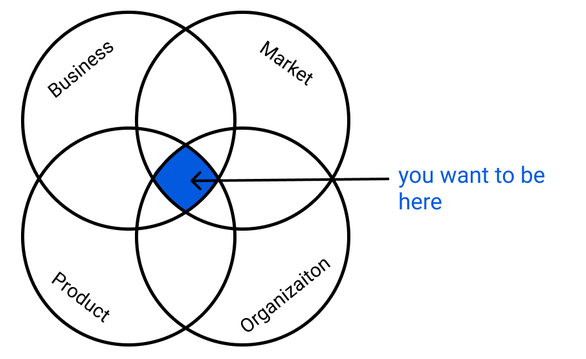
1. Good product-market fit
The product-market fit. If you’re building your own business, there’s no way you haven’t considered it. Marc Andreesen, who is credited with developing the concept, describes it as finding a good (profitable) market with a product capable of satisfying that market. Think of it as sailing, where your product is the sail and demand is the wind. For the boat to work, you need to build a sail and find the wind to power it.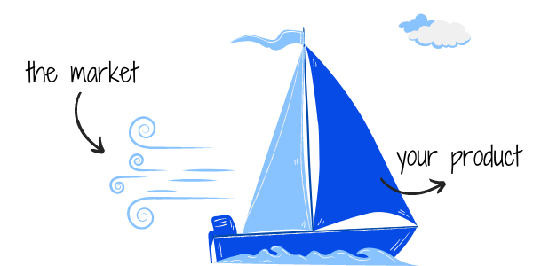
The difficulty in finding that ‘fit’ comes from the fact that there really is not one set formula for achieving it. Dan Olsen, the author of The Lean Product Playbook, points to six items that are a good start:
-
Determine your target customer
-
Identify underserved needs of that customer
-
Define your value proposition
-
Specify your minimum viable product (MVP) feature set
-
Develop your MVP
-
Test your MVP with customers
If Dan hasn’t convinced you yet, on our blog we’ve also discussed why building a minimum viable product early on can save you time, resources and help you find the product-market fit faster.
Alex Shultz, Facebook’s VP of Growth, develops every startup’s life into two key stages: before product-market fit (BPMF) and after product-market fit (APMF). His ideology is the following: before you develop a product that you confirm enough people are willing to pay for, your team cannot afford to focus on other important strategic objectives, like growth or upselling.
The other difficulty is measurement. How do you know you found a good product-market fit? Sean Ellis, another famous entrepreneur and author of Hacking Growth developed a series of customer satisfaction questions to asses what is the growth potential for the product. The most important question was:
How would you feel if you could no longer use [this product]?
-
Very disappointed
-
Somewhat disappointed
-
Not disappointed (it isn’t really useful)
-
Not applicable (I no longer use [this product])
The users who respond “very disappointed” represent your actual target market, despite the fact that many people might give it a try.
2. Clear benefits of your product
Users only want to interact with apps/products which provide real value - these that can save time, provide a more customised experience or make life more enjoyable. Don’t forget that your audience invests their time to sign up to your service and parts with their personal data, and it is up to you to provide value from the product, so they can see that as a fair exchange.
When you are crafting your own product, don’t go down the slippery road of focusing solely on your features or mistaking features for benefits.
Features are aspects of your product, which could be technical or descriptive.
Benefits are why that feature matters for your customers. In other words, how that feature makes their life better.
Here’s an example: Let’s say your product is a water bottle. A feature is a “triple-walled, vacuum-insulated construction”. A benefit is that “it will keep your beverages cold for up to 24 hours”.
For one of our recent clients UNIQA, we worked on improving their health insurance app, called MedUNIQA. In this project, a feature is the ability to submit claims directly in the app, while the benefit for users is the fact that users would save time from going to the UNIQA office.
Don’t assume that by listing your features, customers will figure the benefits by themselves. Clearly tell them what those features mean for them.
3. User experiences that delight
When designing a wellbeing app, UX/UI designers consider all aspects of the design and feel of the app and dive deep into the underlying effects that colours and language can have on users. According to colour psychology, blue reduces stress and tension, while yellow powers memory and concentration. Shapes too can affect the way we perceive a certain digital product. The 90° angles of squares and rectangles offer a sense of reliability and security, while oval shapes can evoke softer and milder and are associate with a feeling of protection and completeness.
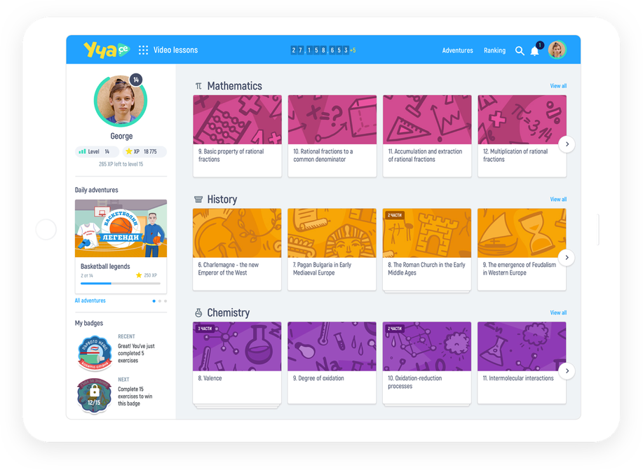
All of these come into play when designing digital experiences, together with the overall user flow, the used language and other factors. We have pretty solid opinions about UX/UI design but one of the most crucial elements in any design process is the user research. When we redesigned the Ucha.se learning platform, we knew it had to cater to students from various age groups, so the design needed to be colourful and playful enough for children in primary school, but also not too childish, so as to repel teenagers. We redesigned the whole platform with this in mind, starting with the brand look and feel. We used vibrant colours with strong contrasts and rounded shapes that give a feeling of comfort.

Wrapping up
Thinking about creating your own digital product is the start of an epic journey. If you’re still early in your journey, perhaps our CEO Stoyan Ilchev’s advice on mastering product development can help you out. If you’ve got those cleared out and are building your prototype, check out our piece on making the best of prototyping for your business.
Whatever stage you’re in, we’ll take time to ask the hard and boring questions to get your from idea to product. We can help you in clarifying and developing your proposition, launching your MVP and scaling your product. Get in touch with us and we can start working on your big idea today.


