Image credit: Illustrations App Korea
User Experience Design in education is particularly complex
Edtech products, especially those aimed at children, have to cater to at least 3 personas with very different behaviours and goals - children, parents and educators. Each of those groups has very specific and very different needs. While children will prioritise the entertainment element, teachers most probably are more interested in the learning aspects. How can you answer all those user needs and still create a smooth user flow with a consistent user interface? Every edTech brand has been confronted with that challenge.
Your learning content is well-crafted, your marketing strategy is solid, but users seems to drop-off early in their journey. Or even worse, some have even left negative reviews about the product’s usability.
So where do you go from here?
Here is our tried and tested approach for identifying and drop-off points in Edtech products, as well as some common UX challenges we had to solve recently.
How to identify drop-off points in your Edtech product
-
Conduct a UX audit
We cannot stress this enough. A UX audit can be really useful in identifying core user pain points that might negatively affect conversion and retention rates or any usability issues. We normally like to start each of our projects with an audit, because it gives a much clearer idea of how we need to move forward. We then adjust its scope and focus based on the product at hand (read more about our UX audit process and logic).
We recommend checking out Jon Yablonski’s Laws of UX as a good starting point for some basic design principles Edtech products should follow. We’ve also had our fair share of UX/UI work that helped us craft our own UX/UI mantras.
2. Identify specific pain points with user testing/ user interviews
Observing how users use your product in real time will give you a lot of insights about some of the difficulties they might be facing. User testing can be done in the form of interviews or focus groups, but they are generally task-oriented: the user will be asked to complete a specific journey, while the UX researcher identifies where there might be stumbling blocks.
These might be checking if users understand the navigation or observing how easily and quickly learners and educators accomplish tasks (completing a lesson, reviewing a test, etc). Once you know the specific issues your users are facing, you are much more equipped with knowledge to implement changes that will yield some results.
3. Look for inspiration elsewhere
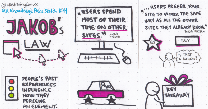
It is always a good idea to benchmark your edTech solution with other available tools on the market. By understanding which UX patterns your users are familiar with, it will be easier to design intuitive interactions within your edTech product. Remember, Jakob’s law states that users prefer your product to work the same way as all the other products they already know and use. This significantly decreases the amount of time they’ll need to get the hand of your product.

Image credit: Krisztina Szerovay
Common user struggles we have identified in our work
UX not catering to teachers, learners and administrators
When you design an educational product for children and you expect it to be used by teachers in classrooms, know that teachers will require a back-end dashboard where they can analyze the usage of the product, the results, keep track of activities, possibly customize such activities, and more. This part will be a different task from the kid-facing side of the product as it will be a part of your children’s product designed for grown-up needs in a professional setting, and this is just another example on how complicated a product “for kids” can be.
Alicia Quan, a fellow UX researched and educator, has also talked about the struggles of teachers in keeping track of all the student’s comments in Google Classroom.
Confusing navigation or instructions
We recently conducted a UX audit for an e-learning platform, where we noticed that in the ‘Test your knowledge’ section, the question slightly changed its position on the screen. Moreover, when learners needed to complete an exercise in the same section, they were asked to ‘connect the terms’ but the activity they had to complete was actually ‘drag and drop’.
Our concerns were confirmed once we did the user testing, that these small details had a significant impact for younger students, who said they found the ‘Test your knowledge’ section “a little confusing”.
Small but important details like these can unintentionally create confusion for your users, who might give up the process altogether after a few failed attempts.
Targeting the wrong user group
During our redesign task for the Ucha.se learning platform, we interviewed a total of 18 children from the 5th to 12th grade. We found that younger children relied on the platform more often than older ones, and most enjoyed the visual outlook of the platform. However, older students (16 years-old and above) were annoyed by some of the videos having unnecessary jokes and they generally perceived the design & outlook of the app to be too childlike.
So how do we make the design appealing for both? While we chose high contrasting, vibrant colors and a modern logo design that will appeal to older students, we created a playful and memorable mascot to give life to the logo and make it attractive for the younger audience.
.png)
The Takeaway
Creating meaningful learning experiences that are easy to grasp and entertaining enough for all user groups is hard task, that’s for sure. But taking the safest road of building a generic UX with not one user persona in mind, will likely result in low engagement and rates, if not in negative user reviews. Use our recommendations to keep your product competitive and your users delighted.
If you’re in need of design & development support for your Edtech product, get in touch. We’re always looking for partners who share our belief in creating user-centric learning experiences.


