Image credit: Pixel True
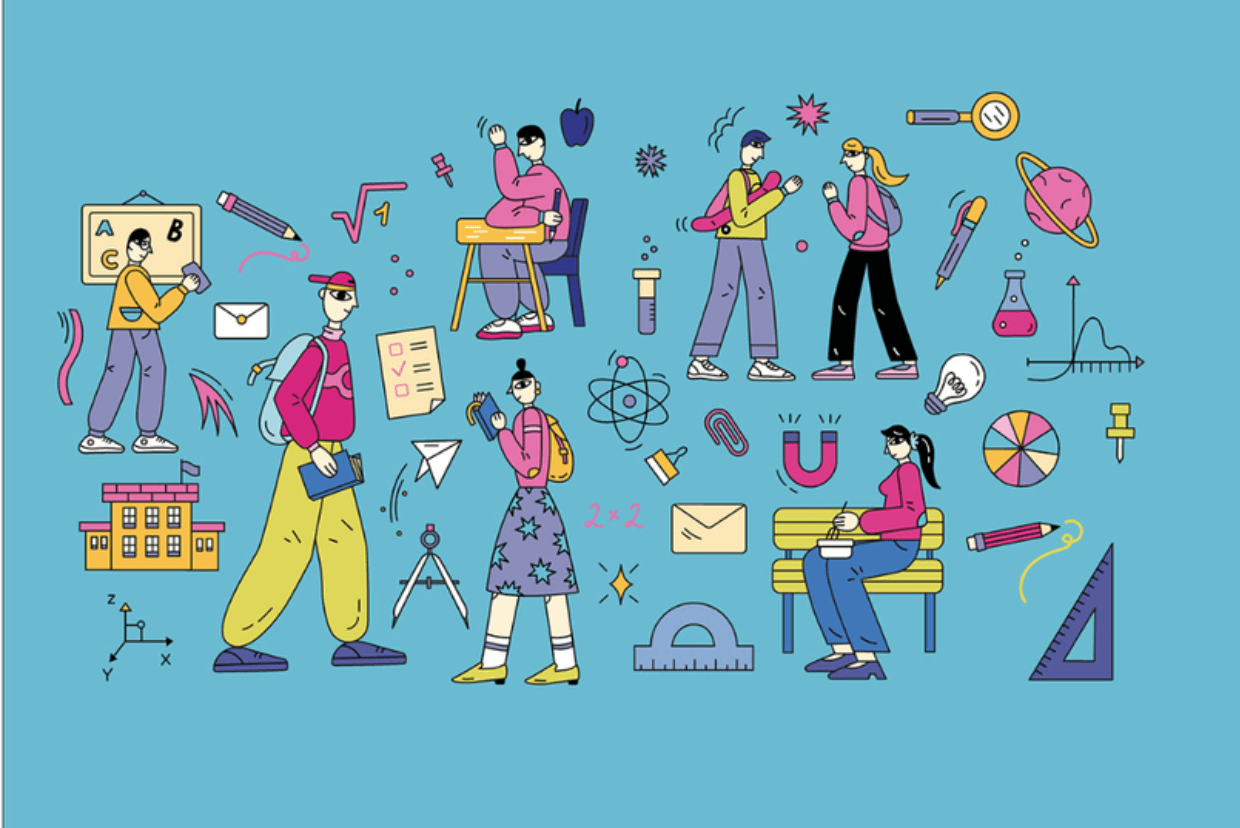
Learning experience design (LXD) is defined as “the process of creating learning experiences that enable the learner to achieve the learning outcomes in a human-centered and goal-oriented way”. LXD is about simplicity - it is about making complex ideas easy to understand and stripping away visual elements that might put an unnecessary mental strain on the learners.
In this article, we take a birds' eye view on the visual strategy for edTech products. Taking best case practices from edTech products we designed & developed, we look at three main elements of learning experience design you should be mindful of - pedagogical, socio-cultural and technological.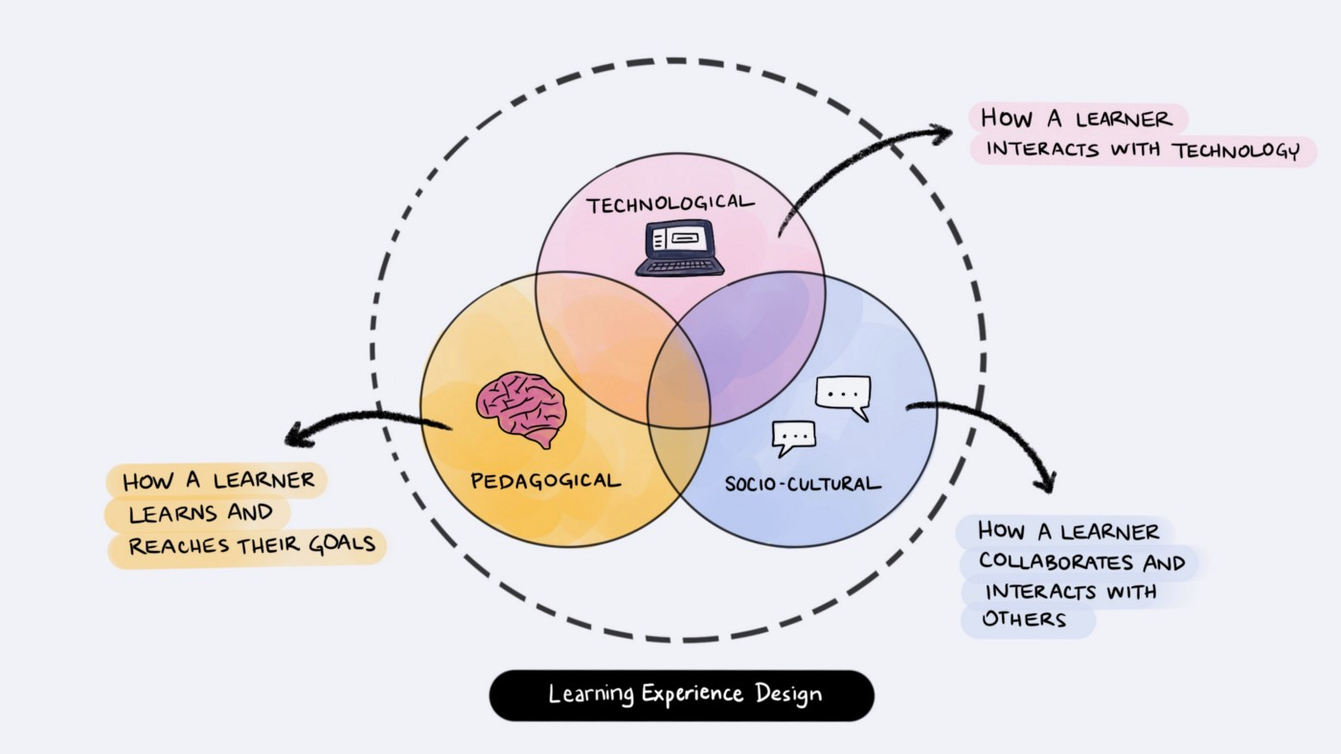
Source: Aletheia Délivré
1. SOCIO-CULTURAL:
Consider the collaboration between learner and teacher
If you’ve experienced Zoom fatigue from working remotely, your kid had it even worse during distance learning. In the last two years, we understood the hard way that digesting information in an online class requires more cognitive effort, and students had a much harder time focusing and acquiring new knowledge. Richard Mayer dives deeper into how channels can help students learn more effectively in his Multimedia Learning Theory. Some of his observations include:
The Redundancy Principle: “People learn better from graphics and narration than some graphics, narration, and printed text.” (p. 118)
The Personalization Principle: “People learn better from multimedia presentations when words are in conversational style rather than formal style.” (p. 242)
The Voice Principle: “People learn better when the narration is spoken in a human voice rather than in a machine voice.” (p. 242)
These principles, and the experiences most of us had in 2020 show that, despite the theories of some tech enthusiasts, students can’t stand online learning that is solely computer-based. Designing smarter learning management systems and e-learning platforms is about more than relying on AI to do the heavy lifting within digital communities. It requires us as product owners and UX designers to think about the pedagogical tools that support student collaboration and foster hybrid teaching.
When we worked on the Ucha.se learning management system, we knew how important it is for students to be able to communicate directly with teachers after they’ve watched the video lesson, so we made sure a comment section was visible under each video, similarly to market leaders Udemy, Coursera and Khan Academy. When a comment is posted under a video, the teacher is notified, so that he can answer questions quickly, while the student is still in the learning process.
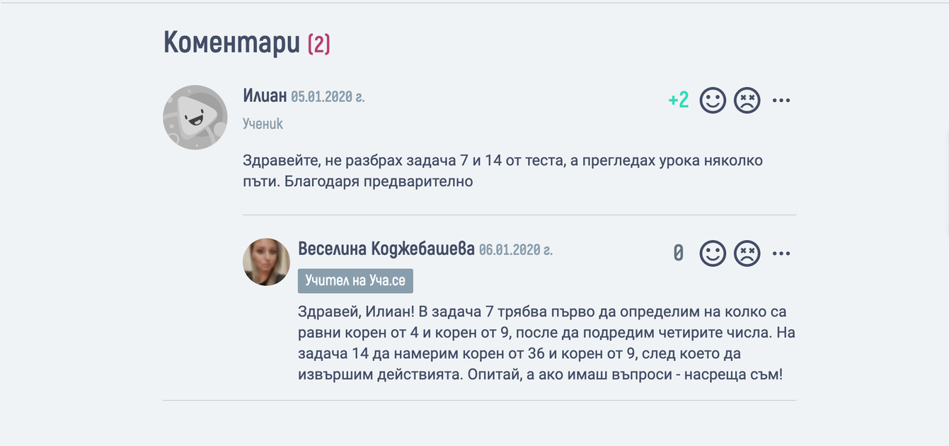
Screenshot of Ucha.se, where a student and teacher discuss questions on the video.
2. PEDAGOGICAL:
Understand the learning and teaching dynamics
When teachers are designing their course, they consider many factors, like subject matter, class size, class duration, as well as their personal preference and confidence for delivery. So to make an edTech product truly useful, we need to understand how an education product could fit within the learning dynamic. Alex Britez, Edtech designer & Adjunct Instructor at NYU’s Digital Media for Learning, makes a really good case of when and for what purpose he uses edTech tools during his teaching.
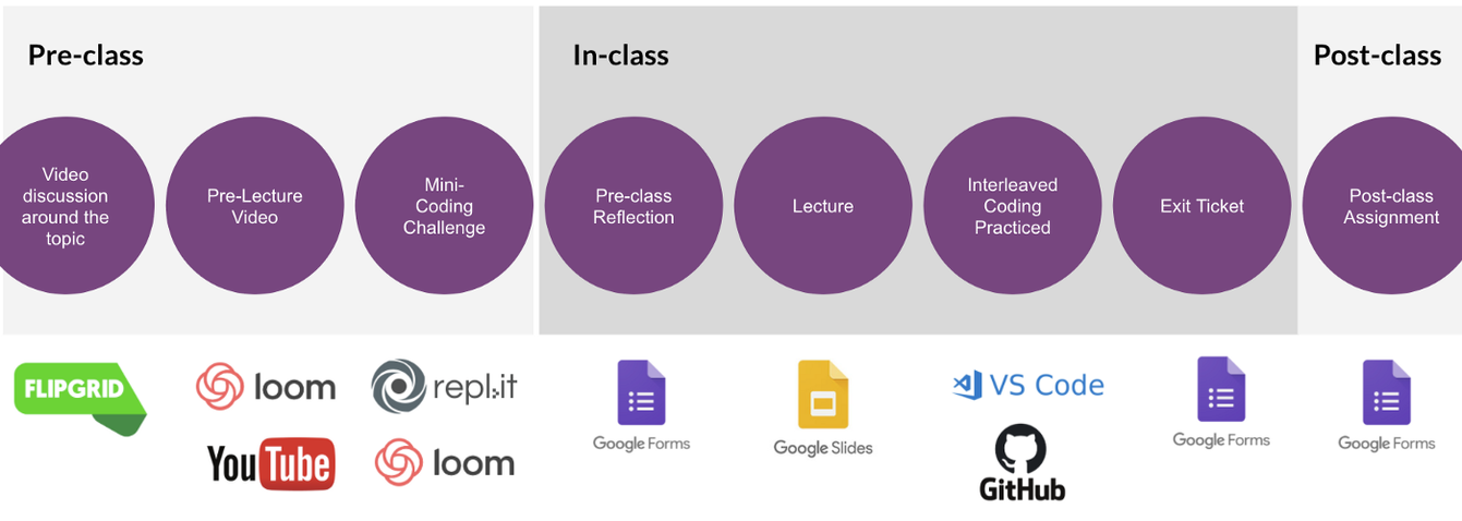
Source: What does UX in education look like
As you can see, specific products, like Flipgrid might work really well to introduce a topic, but might not be convenient when a lecturer is trying to present a topic structurally. That is not to say that it is not possible to develop a full-course platform solution that aligns with all teacher needs. It just means you need to look at your edTech solution from the shoes of a teacher.
How does it fit within their holistic plan and environment?
What might they be doing right before they use your product, and what they might do right after?
How well does your product fit in those transitions?
Are there opportunities worth exploring?
3. TECHNOLOGICAL:
Aim for simple and predictable user experiences
“Learning a new skill is supposed to be hard, but it doesn’t need to be complicated. The difference between the two is the design.”
- Andre Plaut
Often the focus of Edtech businesses is on product functionality instead of visual design, and we have plenty examples of edTech solutions with clunky interfaces. EdTech products need to cater to the visual preferences of both teachers and learners and when these are not clear, the visual design ends up not catering to anyone.
During distance learning, many children struggled with navigating the e-learning platforms by themselves, accessing class notes or homework, and generally felt demotivated and discouraged. A fellow UX designer and a mom Nicole Gallardo even dived into what was causing confusion with the Canvas interface for her children and how it can be improved (check out the full article on Medium).
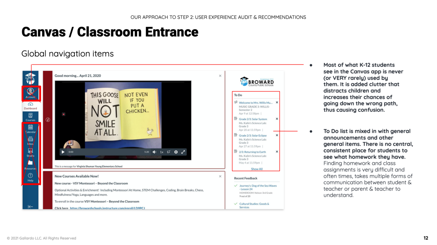
Source: Medium.com
But before judging Canvas too quickly, let us recognise the fact that edTech designers must compete for students' attention with slick, consumer app interfaces with lots of immersive features (a lá TikTok) to provide a learning experience that is fun and rewarding, but also efficient enough. That is no easy task.
In edTech, we often have complex experiences to facilitate - like course management systems or assessment tools for teachers. And as designers, our goal is always to present information that is simple and intuitive to the user, no matter how challenging the product was to build.
One way to achieve simplicity is through predictable patterns. When you use common UI patterns, the user can guess how features function before they interact with them. This frees up their conscious mind to make more formal decisions or learn a new concept. When we designed the Ucha.se platform, we integrated a very simple, yet intuitive iconography, to present lesson categories effectively, without relying on text-heavy instructions.
Ready to shake things up?
Visual design for education can be challenging, yet extremely rewarding. Our passion for education is what continues to inspire us as a team to create awesome learner experiences, day-in and day-out.
If you also dream of shaking up the education industry and create products that improve how learners and educators experience the world, get in touch. We’re always looking for partners who share our beliefs.


