Tamedocs
Empowering patients, GPs and insurers to securely access medical records via a collaborative digital platform
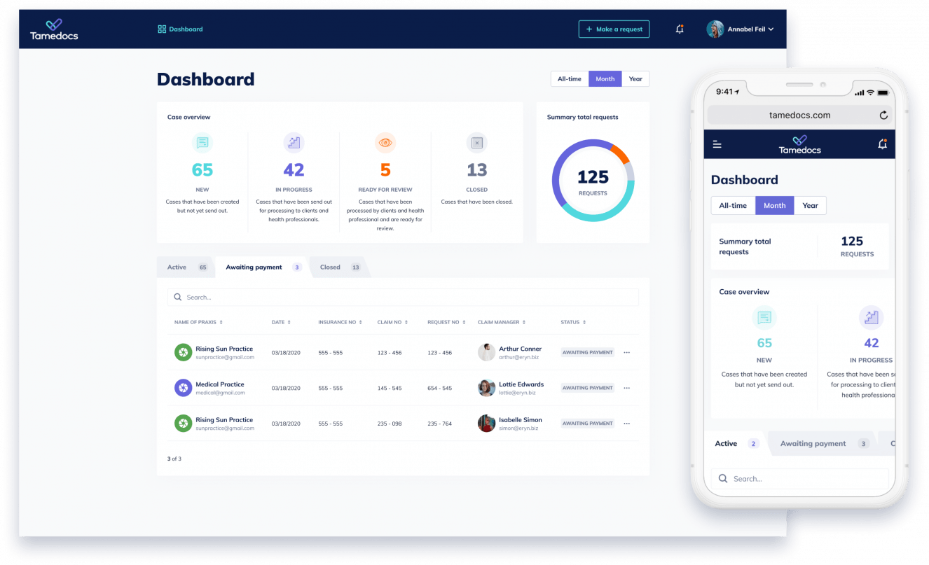
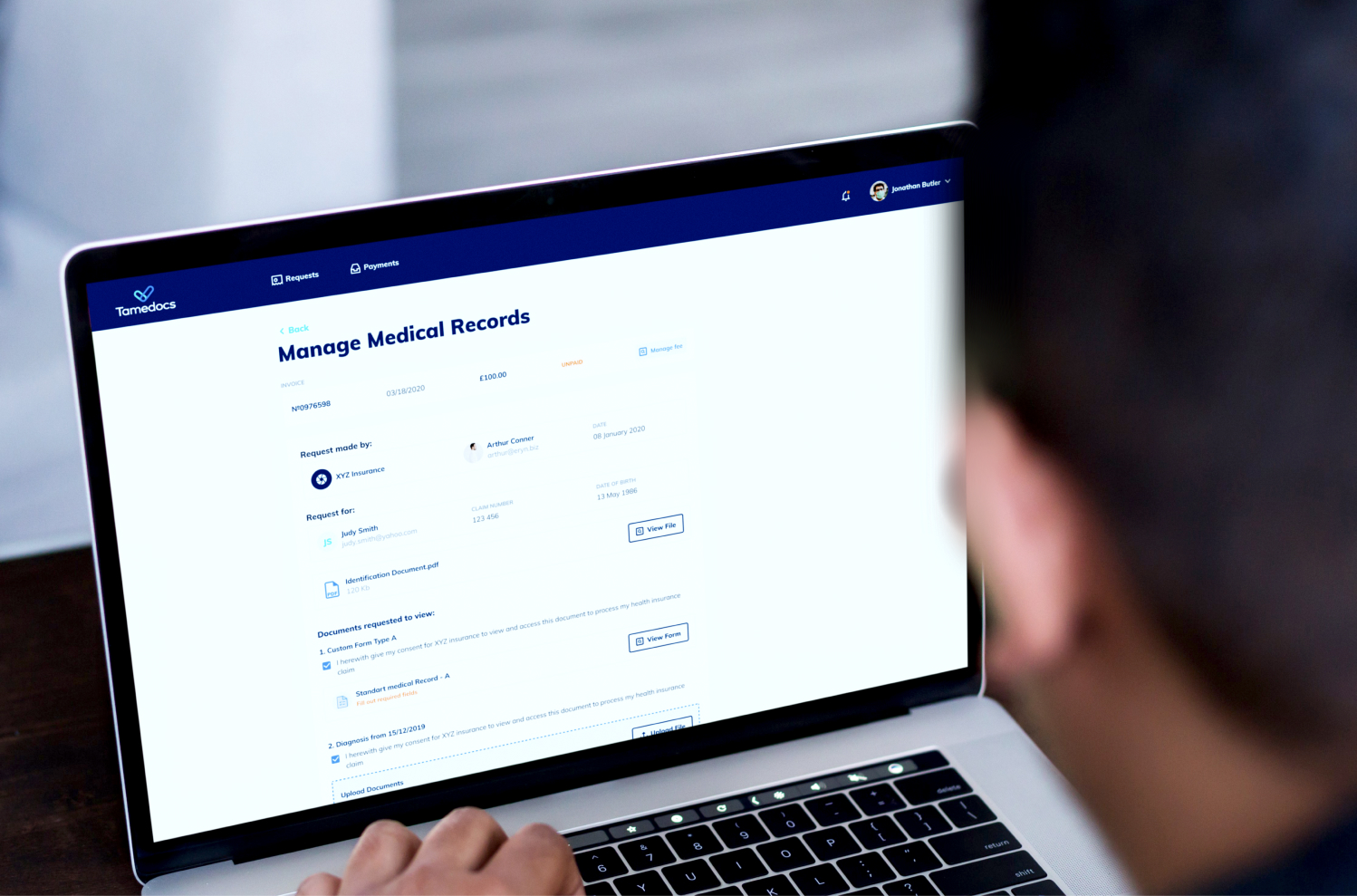
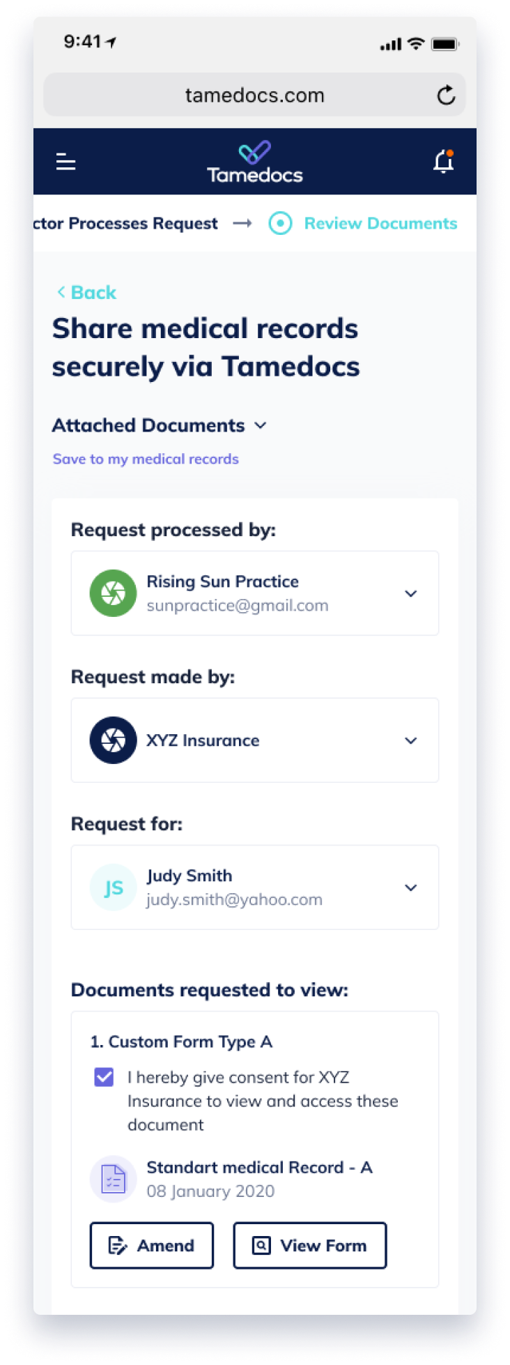
Tamedocs wanted to improve the way that medical records are shared between health insurance providers and GP practices, eliminating the frustrating bottlenecks that traditional methods of sharing create. We worked with them to build a digital platform that allows consent to be given and documents shared, stored and amended, allowing GPs, insurers and patients to access records and get claims processed more quickly.
The Challenge
Achieving efficiency for health insurers was the main project goal, in order to improve the time consuming and admin-heavy way claims are traditionally processed. This normally involves a patient giving consent via GP visit for medical records to be shared, and lengthy back-and-forth communication. Tamedocs would also provide benefits for patients, allowing them to access their own medical records at any time without lodging a specific request.
What We Did
Over the 8 month project our ten-person team provided Discovery, frontend and backend web development for this innovation project of a large organisation.
Insights
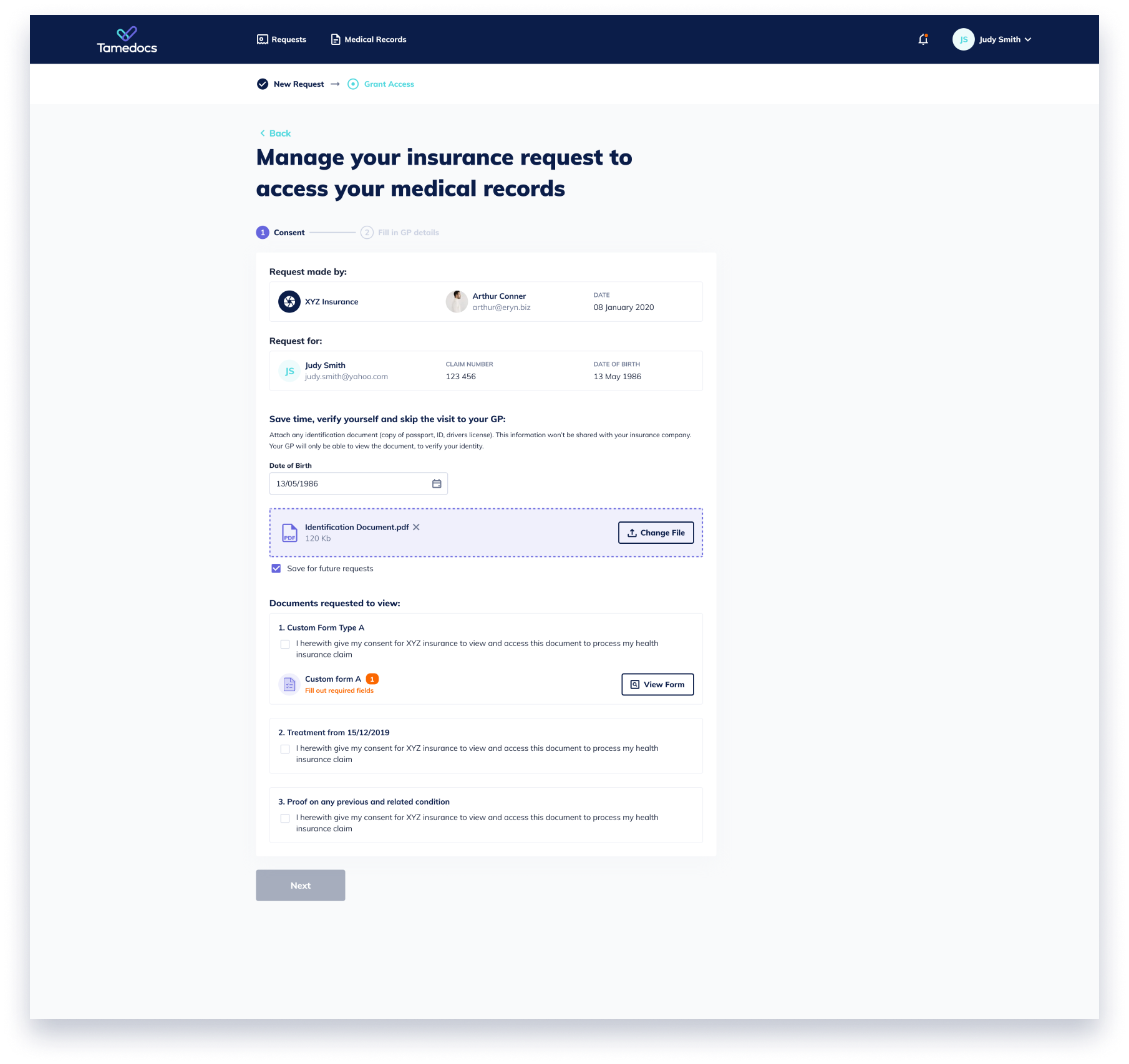
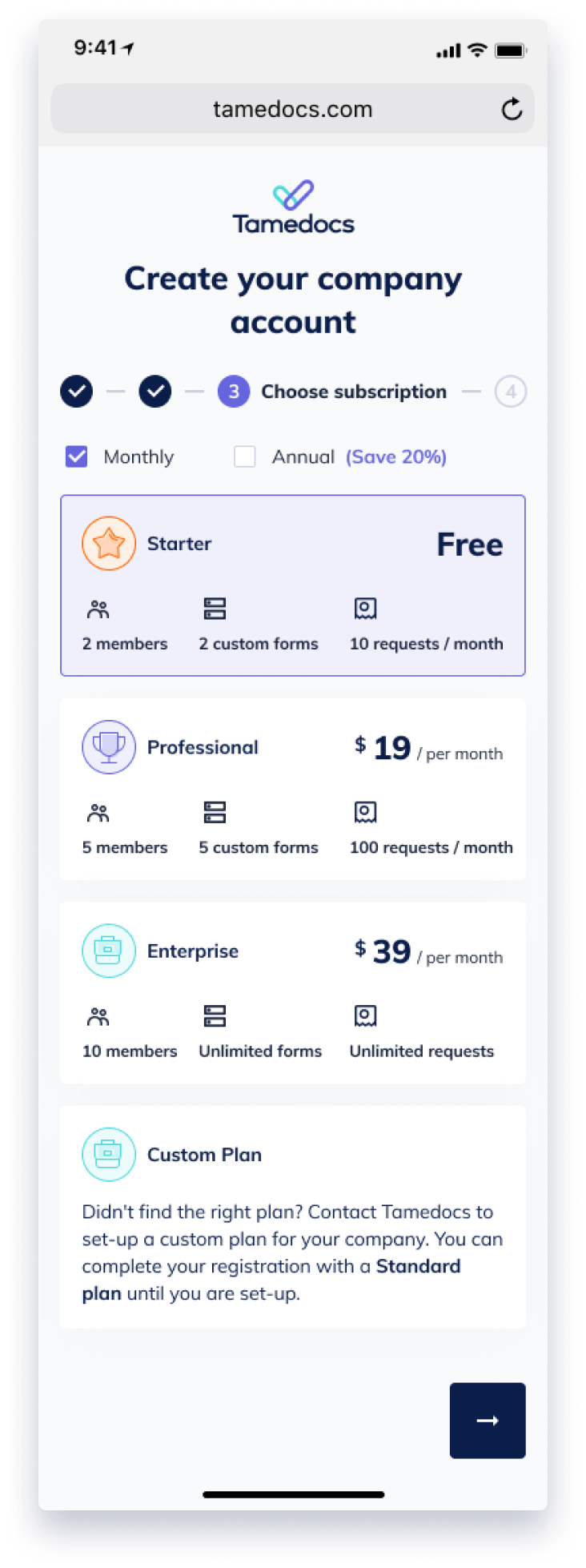
The Discovery stage provided insights into the UK health insurance industry and how access requests to medical records, involving the patient and the GP, are currently handled. The new platform would provide efficiencies not just to insurers, but also to GPs. Patients will also gain greater control and transparency. We spent much time on pinpointing the user flows, so that each participant on the platform can have a smoother claims handling process while ensuring data security and privacy.
Approach
We assembled our in-house team of 10 including project manager, producer, front- and backend developers and QA, and quickly got underway with the Discovery stage, which lasted two months. Initially, the client provided the designs and overall flows. During discovery, our main task was to create detailed user flows and to work out what else was needed in terms of functionalities. We created some low-fidelity wireframes to demonstrate the missing screens and any amendments to the initial designs.
The designs were already given by the client and came from an external design agency. We worked together with them to update and create new designs based on our flows and wireframes.
Following this, the development team reviewed the screens in more detail and we went through a process of refining the flow and clarifying functionality in more detail. Development is carried out one user flow at a time, with additional clarifications answered as we develop the platform.
Challenges
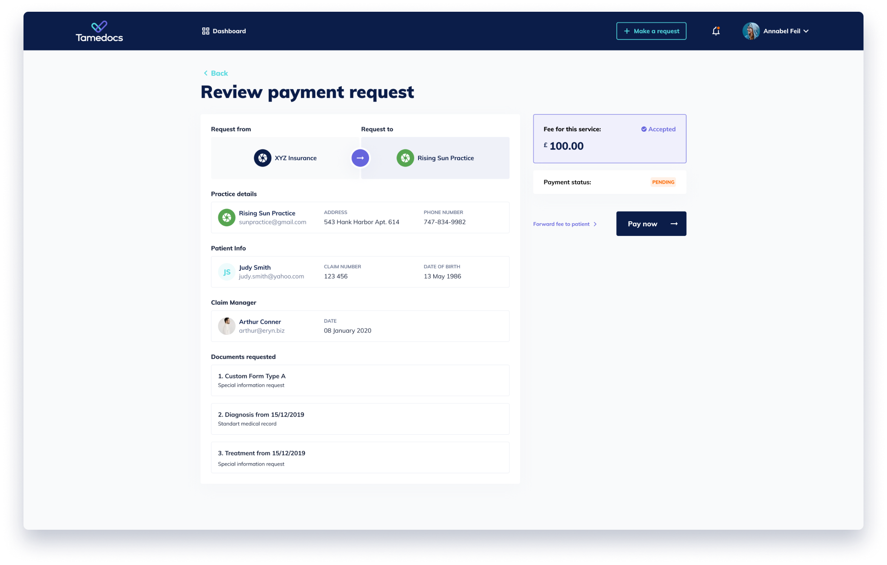
Making sure the integrated payment processes are seamless and comply with the desired level of security.
Evolving a clear and responsible data retention policy.