What would banking look like without human customer support?
BNP Paribas pioneered the creation of deposits, entirely online. In an effort to further improve their customers experience, BNP Paribas approached us to help them understand if, through clever design and user experience, they could create a marketing website and customer portal that would make their customers feel special and improve the efficiency of the banking process on both sides.
BNP Paribas’s vision
Our marketing website should communicate the product clearly and make it quicker for everyone to apply online. Our customer portal should make it easier for people to manage their deposits online, minimising the need for a human to be involved.
The end result was a success among existing and new customers.
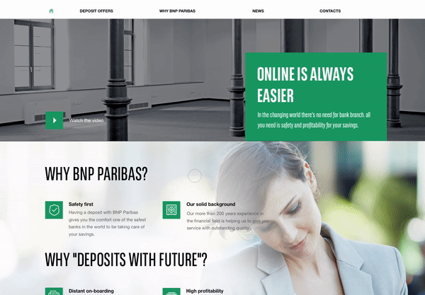
Final version of the public website.
A great partnership
For many of BNP Paribas’s customers, accessing the portal is a frequent necessity and to ensure that the challenge we had to overcome was a feasible one, we talked to all of the people running the project. People who work with clients day-to-day and with all of the sales people within the organisation to understand user’s pain points and motivations. Everyone was extremely passionate and there were a lot of challenging conversations to drive the project forward. Our main objective was to position BNP as a leading provider of deposits which put their clients first by making it as easy as possible to do everything online.
Struggling with infrastructure
As a product agency, we are always drawn to creating something great, something that has all of its part as perfect as they can be. Partnering with a bank always involves working within the constraints of the existing infrastructure which is often times either difficult or just impossible to change. We believe that innovation can still be obtained even if things can’t be perfectly designed or engineered. A small change in the right direction is still a significant progress. Making life for people better is always a reward worth pursuing.
From insights to results
Following our Discovery process which gave us valuable insight into the challenge at hand, our UX and strategy team worked with BNP Paribas intensively. We outlined all user journeys, minimised and reorganised the information we collected from users and made sure that our ideas were based on improving both speed and utility in the banking process.
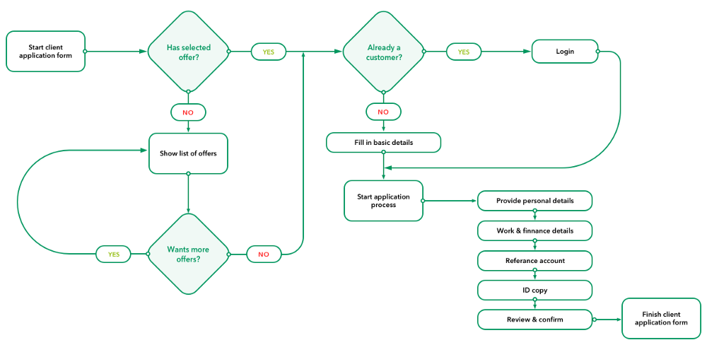
We mapped the application process to make sure every scenario is covered.
We workshopped different approaches to achieve the goals we outlined. This included a mini design sprint with the design team to generate different ideas and approaches. We picked the best ideas from everyone and moved on to wireframing.
Through testing of the marketing website, we found that users felt lost during the application process and it was hard for them to understand how long it would take. So our main aim was to simplify the application process as much as possible, explain why we need the information we ask for and, ultimately, make it easier for them to save their progress and continue afterwards.
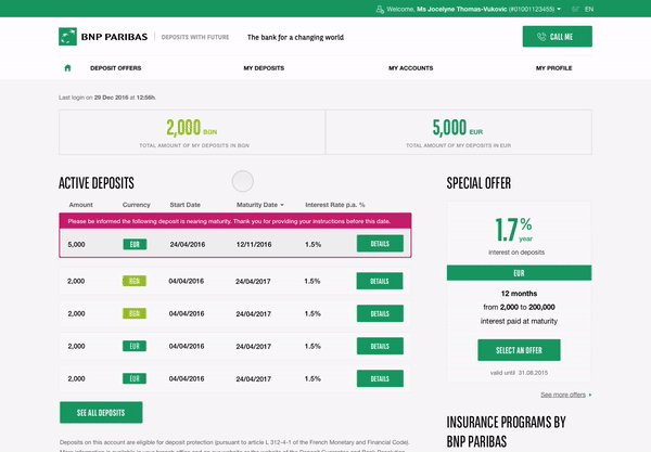
The internal portal had its own challenges. Users were struggling to find information and this was mainly down to the navigation and information architecture in the portal. We completely reorganised the whole navigation, made the information easier to scan, surfaced the most recent actions on the dashboard and made the whole experience work seamlessly on mobile to drastically improve user experience for customers that often use their mobile phones to quickly check the status of their deposits.
Once our wireframes had been thoroughly reviewed, we moved onto design to breathe life into the layouts we had created. This included creating a style guide which the design team used to ensure consistency throughout all layouts of the platform, which were aligned to BNP Paribas’s brand guidelines.
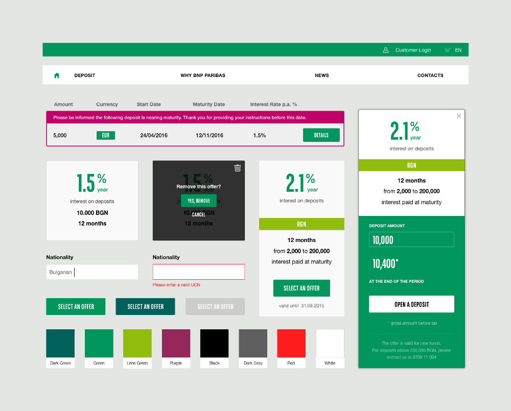
Style guide which was implemented on both the public and the private portal of BNP Paribas.
We then used InVision to create a clickable prototype which allowed us to test the application on real people in real time, before development.
We used a prototype created in InVision to test how people will react to the updated UX and design.
Usability comes first
- To test our hypothesis, we worked with both existing and new clients of BNP Paribas to see how they would react to the changes we’ve made.
- To facilitate user testing, we created a set of scenarios and asked users to complete them. Then we asked them to compare the process to the existing one and tell us which one they found more intuitive. We also carefully monitored the way they used the platform and were able to identify a few subconscious stumbling points which we addressed with updates to the prototypes.
- As an organisation, our focus is on utility so part of our conversations with users consisted of us understanding their digital habits. This helped us inform our future roadmap and what else we could do to make their lives easier. BNP Paribas values their customers’ time so our aim was to ensure that, when interacting with the bank, the process was fast, enjoyable and overall, useful for their clients.
The results showed drastic improvements with users finding it was much easier and faster to achieve tasks.
What did we achieve?
The rethought and redesigned platform deposits.bnpparibas.bg has seen huge traffic increase. The update UX and strategy let to 2.5x increase in the number of the completed full application forms for the first 6 months of the launch of the website and it also saw a 5.5x increase in the overall requests.
Numbers are important for us, but what’s more important is how people see the work that we do.
I am extremely happy with the speed, reliability and the transparency of the platform. – BNP Paribas’s customer

